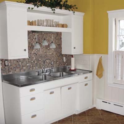
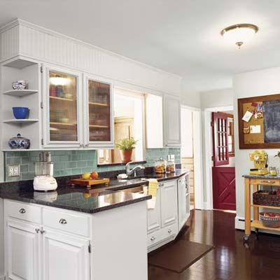
Paint Cabinets Instead of Replacing Them
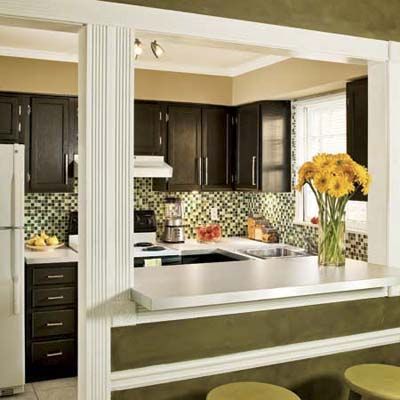
With kitchens, simple does not necessarily equal streamlined. For these homeowners the kitchen that came with their Atlanta condo fell short on both frills and function. It was a sad space, that included builder-grade cabinets and white laminate counters. Opening the dishwasher blocked the oven door and vice versa.
They used a little DIY-know-how for their budget kitchen remodel and removed, repainted, and reinstalled the cabinets. They also purchased a wet saw and cut the glass tiles for their backsplash themselves.
Take a look at The $967 Kitchen Remodel to pick up a few money-saving pointers and design ideas.
See also:
• How to Paint Kitchen Cabinets
How to Install a Glass Tile Backsplash
• How to Hang Kitchen Cabinets
Paint On Some Wall Stripes
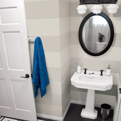
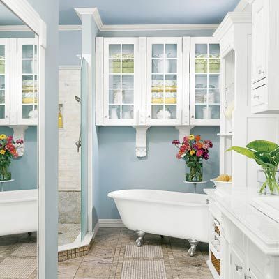
Even in long-haul remodels, some spaces cry out for prompt design attention. For a family moving into a new home in Butler, Pennsylvania, that space was the first-floor bath. Located between a home office and the family room, it’s the most trafficked of the 1927 farmhouse’s three baths and two powder rooms. It sported bare drywall and grungy carpeting.
A full redo wasn’t in their budget, but they decided to make the space just a bit “less embarrassing.” Refinishing everything from the plywood subfloor to the original sink fixtures with paint, this budget bathroom remodel was completed in about four weekends.
Take a look at $439 Bath Remodel to pick up a few money-saving pointers and design ideas.
See also:
• Update and Upgrade With Spray Paint
• How to Paint Stippled Wall Stripes
Shop Online and Save
You spend weeks painstakingly picking cabinets and researching countertops or, sometimes, you just get lucky. During a remodel, a couple from Massachusetts ran across an ad for a kitchen showroom that was relocating and selling off a complete floor model. They were doubtful, but checked it out anyway—and it worked!
They paid $6,675 for base and upper cabinets, plus additional cabinetry, trim, side panels, and appliances, then adapted the setup for their galley-style kitchen.
Take a look at ”We Found Our Dream Kitchen on Craigslist!” to pick up a few money-saving pointers and design ideas.
Save With Surplus and Stock Finds
Sometimes staying flexible is the secret to renovation success. It’s how this Winnetka, Illinois homeowner was able to afford her bath’s overhaul on just $4,000. The upstairs bath in her 1921 Tudor Revival was in bad shape, complete with a rust-stained tub and cracked tile floor. Already redoing the kitchen and downstairs baths, she asked her contractor to squeeze in tweaks to the one upstairs. He offered her a stash of marble tile—left over from another job—at half price! She said yes, even though yellow wasn’t her first choice.
Take a look at The Budget Bath Revamp to pick up a few money-saving pointers and design ideas.
Preserve Retro Charm and Save Big
One Milton, Massachusetts, couple gave their old kitchen a stylish yet frugal makeover. They wanted to keep some of the original retro details like the stainless-steel sink and metal cabinets. After deciding to go with mostly surface updates to their kitchen, they saved a huge chunk of cash—and maintained the kitchen’s vintage charm.
Take a look at The $645 Kitchen Remodel to pick up a few money-saving pointers and design ideas.
Split the Workload With a Contractor
If the bath of your dreams seems out of reach, check out how this Missouri couple got creative—and a little dirty—to make their perfect space a reality. Their smart move? They bid their contractor farewell once the drywall and subfloor were in and did the cosmetic work themselves. The result is this spa-like retreat.
Finishing the work themselves, they stayed under their set $6,000 cap and were able to fill the room with high-end fixtures and finishes, such as a claw-foot tub, marble tile floors, a generous glassed-in shower, and a furniture-style vanity.
Take a look at this Vintage Bath on a Budget to pick up a few money-saving pointers and design ideas.
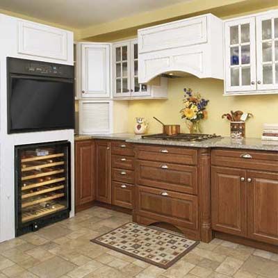
Smart Kitchen Storage
When people walk into your home, you hope the first rooms they see make a good impression. For these homeowners, that meant working nights and weekends putting together a better, more efficient kitchen. Putting in new upper cabinets added much needed storage space. They also dressed up the dated room with new hardware, fixtures, and trim.
Take a look at A Charming Kitchen Revamp for $1,527 to pick up a few money-saving pointers and design ideas.
Total Eyesore to Tranquil Retreat
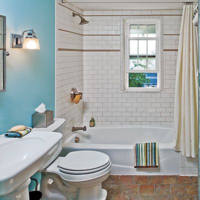
Sometimes it takes an addition to the family to kick a remodel into high gear. Such was the case for this couple in Syracuse, New York. “Skeeved out” by the grim in the full bath left behind by previous owners, they dealt with the eyesore by taking quick showers—never baths. Once they discovered they had a baby on the way, they started shopping sales and eBay for discounted fixtures and created an inviting bath in their 1925 cottage, piece by piece.
Take a look at Total Bath Redo for $2,238 to pick up a few money-saving pointers and design ideas.
Deal Hunters Get a Luxe-Look for Less
How do you afford stainless steel and stone on an almond-bisque-and-laminate budget? For this Connecticut couple the answer was to preserve elements of the existing kitchen that were still in good shape, cut out labor costs by doing the work themselves, and shop sales and Craigslist.
They stayed within the $6,000 budget by keeping the basic layout, painting the oak cabinets rather than replacing them, taking a carpentry course, and trolling the Internet and roaming big-box stores in search of well-priced replacements.
Take a look at ”We Redid Our Kitchen for $6,000!” to pick up a few money-saving pointers and design ideas.
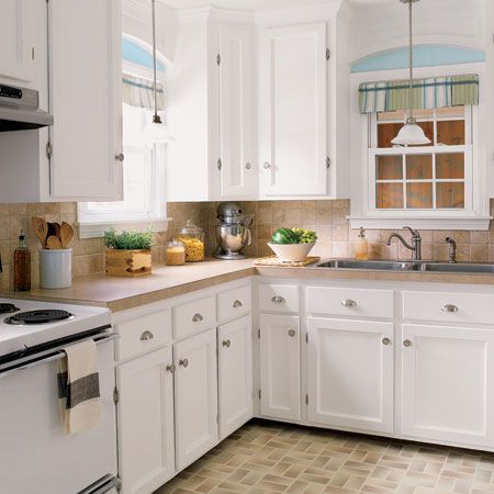
$935 Cheerful Kitchen Upgrade
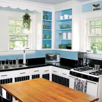
In some spaces, surface changes can make a huge impact. The owner of this 1935 bungalow in Durham, North Carolina, loved the size of the kitchen. “But otherwise,” she says, “it was just dirty, disgusting, and dated.”
With no budget for a complete redo, she decided to use simple, low-cost touches to give the room a new look and highlight original details, such as hardwood floors and the scalloped wood valance above the sink window. While all the cabinets and appliances are the same, new paint, fabric panels, and nickel-finished hardware give the room a colorful new look.
Take a look at A Colorful Kitchen Makeover to pick up a few money-saving pointers and design ideas.