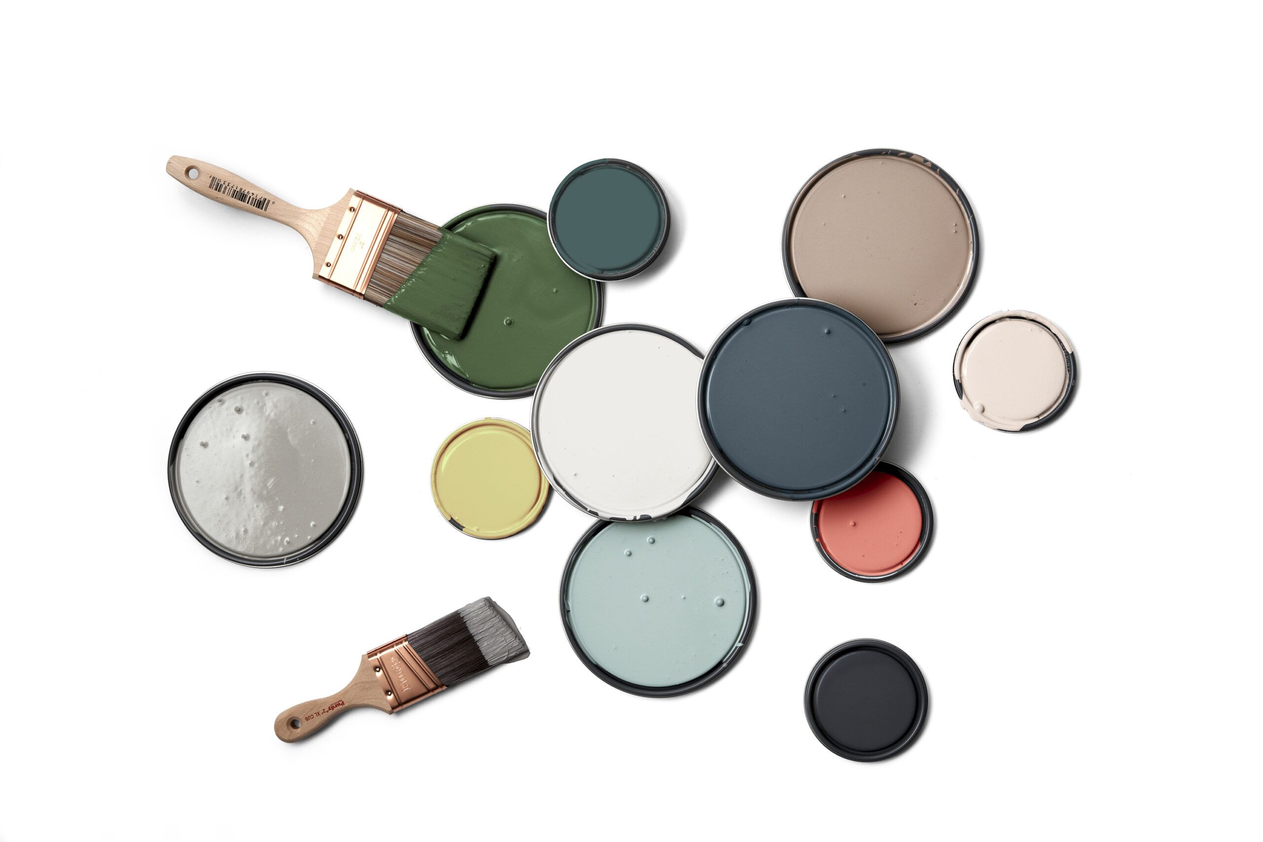
Color has the power to transform a space, turning ordinary rooms into extraordinary works of art. Whether you’re looking to refresh your living room, bedroom, or kitchen, choosing the right color combination can make all the difference. In this guide, we’ll explore no-fail color combos that will inspire you to create visually stunning spaces in your home. From earthy pinks to vibrant greens, we’ll show you how to pair colors that complement each other perfectly, creating a harmonious and inviting atmosphere.
Clay Pink
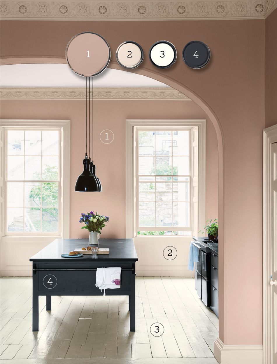
Clay pink is a versatile and surprisingly neutral color that can add warmth and sophistication to any room. This earthy hue provides a playful base for kitchen walls, accentuating architectural details while softening formal elements. When paired with contrasting dark gray on an island, clay pink creates a sense of balance, making the surrounding space feel larger and brighter.
To achieve this look, consider using the following color palette from Farrow & Ball:
- Dead Salmon (walls)
- Dimity (trim)
- Pointing (floor)
- Railings (accent)
This combination of colors creates a cohesive and inviting atmosphere that’s perfect for a kitchen or dining area. The clay pink walls provide a warm backdrop, while the lighter trim and floor colors help to brighten the space. The dark accent color adds depth and contrast, creating visual interest throughout the room. Additionally, using different textures and finishes can enhance the effect, making the space feel dynamic and engaging.
Instead of Clay Pink, Try a Softer Pale Pink Hue
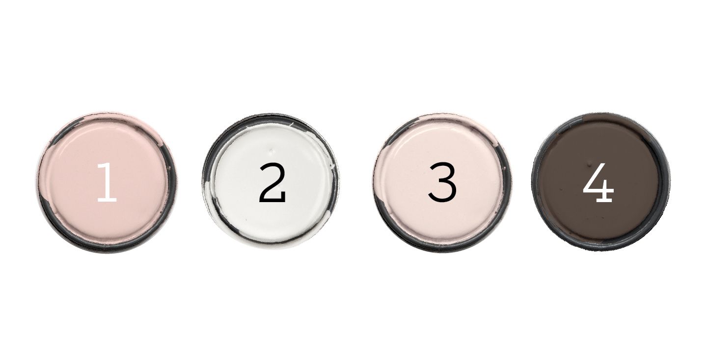
If clay pink isn’t quite your style, consider opting for a pale pink instead. This softer hue works beautifully with dark brown and other warm neutrals to create a cozy and inviting color scheme. For a similar effect, try this palette from Valspar:
- Harmony (walls)
- Swiss Coffee (trim)
- Santa Fe Spirit (ceiling)
- Labrador (accent) (Similar to shown: Hunting Boots or Mystic Taupe)
The pale pink walls provide a soft, soothing backdrop, while the warm neutrals add depth and richness to the space. Introduce some textured fabrics and natural wood elements to bring additional warmth and complexity to the room, creating a balanced and harmonious environment.
Leaf Green
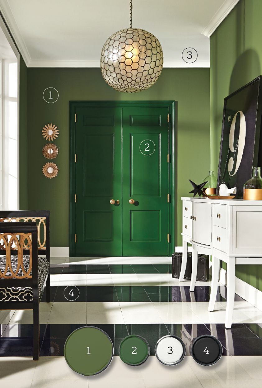
Incorporating a bold, midtone green in a hallway or entry is an excellent way to make a statement in your home. These “peekaboo” rooms, which are often glimpsed only briefly, are perfect for experimenting with high-impact hues. A richer, more saturated green on the door and trim creates a striking focal point, while contrasting white and black elements round out this lush, energizing palette.
For this vibrant look, consider using the following colors from Sherwin-Williams:
- Garden Spot (walls)
- Arugula (accent)
- Extra White (ceiling, trim)
- Caviar (accent)
The bold green walls make a strong first impression, while the white trim and ceiling help to keep the space feeling open and airy. Complementing the look with brass or gold hardware can further elevate the sophistication and add a touch of elegance to the space.
Instead of Leaf Green, Try an Even More Vibrant Color Scheme
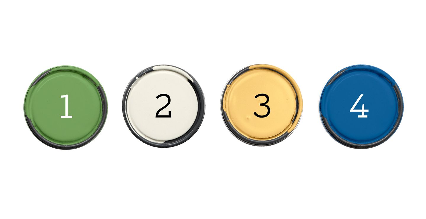
If you’re looking for an even more vibrant color scheme, consider pairing a vegetal green with similarly intense yellow and blue hues. This creates a harmonious palette of related shades that’s both energizing and cohesive. Try this combination:
- Grassy Meadow (walls) (similar to shown: Grasshopper from Sherwin Williams)
- Queen Anne’s Lace (trim) (similar to shown: Whitetail from Sherwin Williams)
- Spiced Butternut (accent) (similar to shown: Honey Bees from Sherwin Williams)
- Rave Regatta (accent) (similar to shown: Hyper Blue from Sherwin Williams)
This bold color scheme is perfect for creating a lively and dynamic space, such as a playroom, creative studio, or even a modern living area. The combination of green, yellow, and blue creates a sense of balance and harmony while still making a strong visual impact. Adding playful patterns or bold art pieces can further enhance the vibrant and energetic feel of the room.
Warm Gray
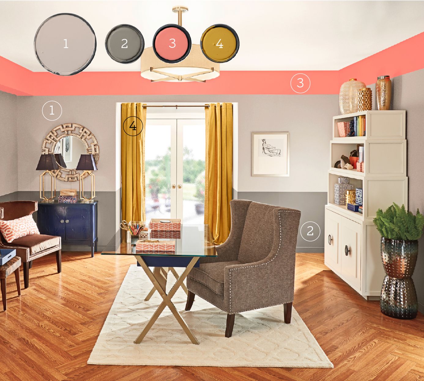
Gray is a versatile color that can sometimes appear too serious or sober. However, when used correctly, it can create a sophisticated and expansive feeling in any room. Here, a wide band of pale taupe gray on the upper walls creates an open, airy atmosphere, while a darker hue at wainscot height grounds the space. To inject some energy and fun, consider adding a high-energy accent color like coral as a border around the room. Warm citron curtains can provide an additional punchy accent.
For this balanced and stylish look, try the following color palette from Behr:
- Penthouse View (upper walls)
- Fifth Olive-Nue (lower walls, baseboard)
- Coralette (accent)
- Citronne (accent)
This combination of colors creates a sophisticated and layered look that’s perfect for living rooms, dining rooms, or bedrooms. The varying shades of gray provide depth and interest, while the coral and citron accents add pops of color that keep the space feeling fresh and lively. Introducing textured elements such as a plush rug or woven baskets can further enhance the layered and sophisticated feel.
Instead of Warm Gray, Try a Gray With Brown Undertones
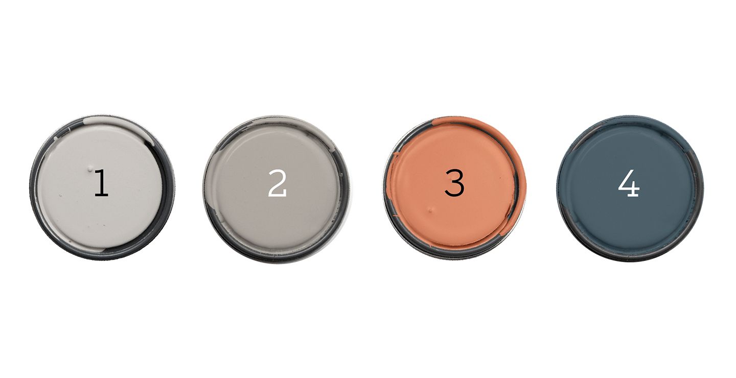
If you prefer a slightly different take on the warm gray palette, consider using a gray with brown undertones. This can be paired with a darker taupe gray and a steely navy, accented with a pop of terra-cotta. Try this combination from Glidden:
- Sutton Place Grey (walls)
- Song Sparrow (ceiling)
- Canyon Stone (accent)
- Approaching Storm (trim, accent)
This color scheme creates a rich and sophisticated atmosphere that’s perfect for a home office, library, or formal living room. The combination of warm and cool tones adds depth and interest to the space, while the terra-cotta accent provides a touch of warmth and energy. Incorporate elements such as wooden furniture and metal accents to add texture and contrast, enhancing the overall sophistication of the room.
Aqua Blue
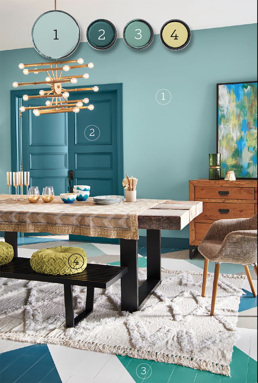
Blues and greens are a foolproof combination because they neighbor each other on the color wheel. Using pale aqua as the dominant color in a dining space makes it easy to layer in bolder colors, such as deep teal on the door and trim. A bright green incorporated into the floor adds an unexpected pop of color, while lime accents pick up the gold tones in the room.
To achieve this fresh and harmonious look, consider using the following colors from Behr:
- Polished Aqua (walls)
- Wanderlust (doors and trim)
- Jade Dragon (accent)
- That’s My Lime (accent)
This color palette creates a serene yet invigorating atmosphere that’s perfect for a dining room, sunroom, or even a bathroom. The combination of aqua and teal provides a soothing backdrop, while the bright green and lime accents add energy and visual interest. To further enhance the ambiance, consider adding reflective surfaces like mirrors or metallic finishes that catch and reflect light.
Consider Pairing Aqua Blue With Rich Neutrals
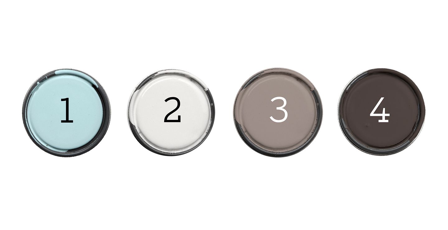
Aqua is a versatile color that can appear either blue or green, much like water itself. For a different approach, consider pairing it with rich neutrals in cool gray-brown tones. Try this combination:
- Misty Aqua (walls) (similar to shown: Air Blue from Behr)
- Silver Feather (trim) (similar to shown: Nimbus Cloud from Behr)
- Talavera (floor) (similar to shown: Kindling from Behr)
- Phantom Mist (accent) (similar to shown: Rave Raisin from Behr)
This color scheme creates a calming and sophisticated atmosphere that’s perfect for a bedroom, home office, or living room. The cool aqua walls provide a soothing backdrop, while the neutral accents add depth and richness to the space. Incorporate natural materials such as wood and stone to enhance the tranquil and relaxed vibe of the room.
Yellow Gold
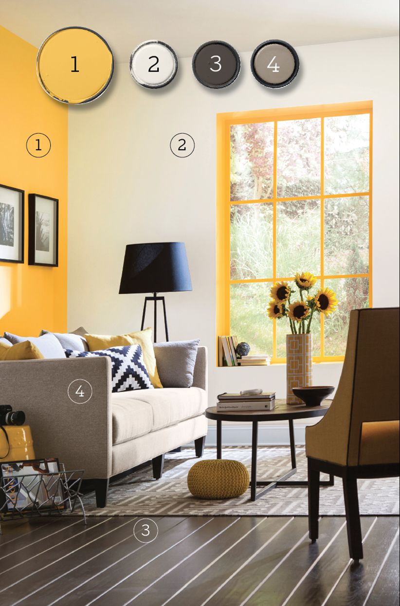
Cheery and bright, yellow gold can be a challenging color to get right, as it often intensifies when applied to walls. To keep this sunshine-inspired shade from overwhelming a space, consider limiting it to an accent wall and windows. Grounding the yellow with sophisticated neutrals like warm white, ebony brown, and taupe gray helps to balance the brightness and create a cohesive look.
For this sunny and sophisticated palette, try the following colors from Sherwin-Williams:
- Rayo de Sol (wall, window)
- Alabaster (walls, ceiling)
- Black Fox (floor)
- Keystone Gray (accent)
This combination of colors creates a warm and inviting atmosphere that’s perfect for a kitchen, breakfast nook, or home office. The yellow gold adds energy and cheer, while the neutral tones help to keep the space feeling balanced and refined. Pairing the palette with natural elements like wooden furniture and green plants can bring an organic touch and enhance the overall warmth of the space.
Try Balancing Bright Yellows With Weathered Neutrals
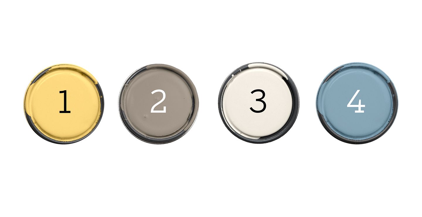
For a modern farmhouse feel, consider balancing bright yellow walls with weathered neutrals and muted blue accents. Try this combination from Valspar:
- Summer Wheat (walls) (similar to shown: Late Day Sun)
- Frappé (ceiling)
- Dove White (trim)
- Summerhouse Blue (accent)
This color scheme creates a warm and inviting atmosphere that’s perfect for a country kitchen, dining room, or living area. The bright yellow walls provide a cheerful backdrop, while the weathered neutrals and muted blue add depth and character to the space. Adding rustic elements such as reclaimed wood and vintage décor can further enhance the farmhouse aesthetic and create a cozy, homey feel.