A Shapely Double Sink
Honoring the history of an old house and upgrading its comfort needn’t be contradictory goals. Just ask Philadelphia homeowner Jenny Brown Baer, who pulled off both in the remodel of her third-floor guest bath. An unfinished DIY reno project, the existing space was seriously out of sync with the rest of the 1897 Dutch Colonial twin home—not to mention unappealing. “I wanted to evoke the simple, utilitarian style of the 1920s, but still make the bath attractive and practical for visits from my large extended family.”
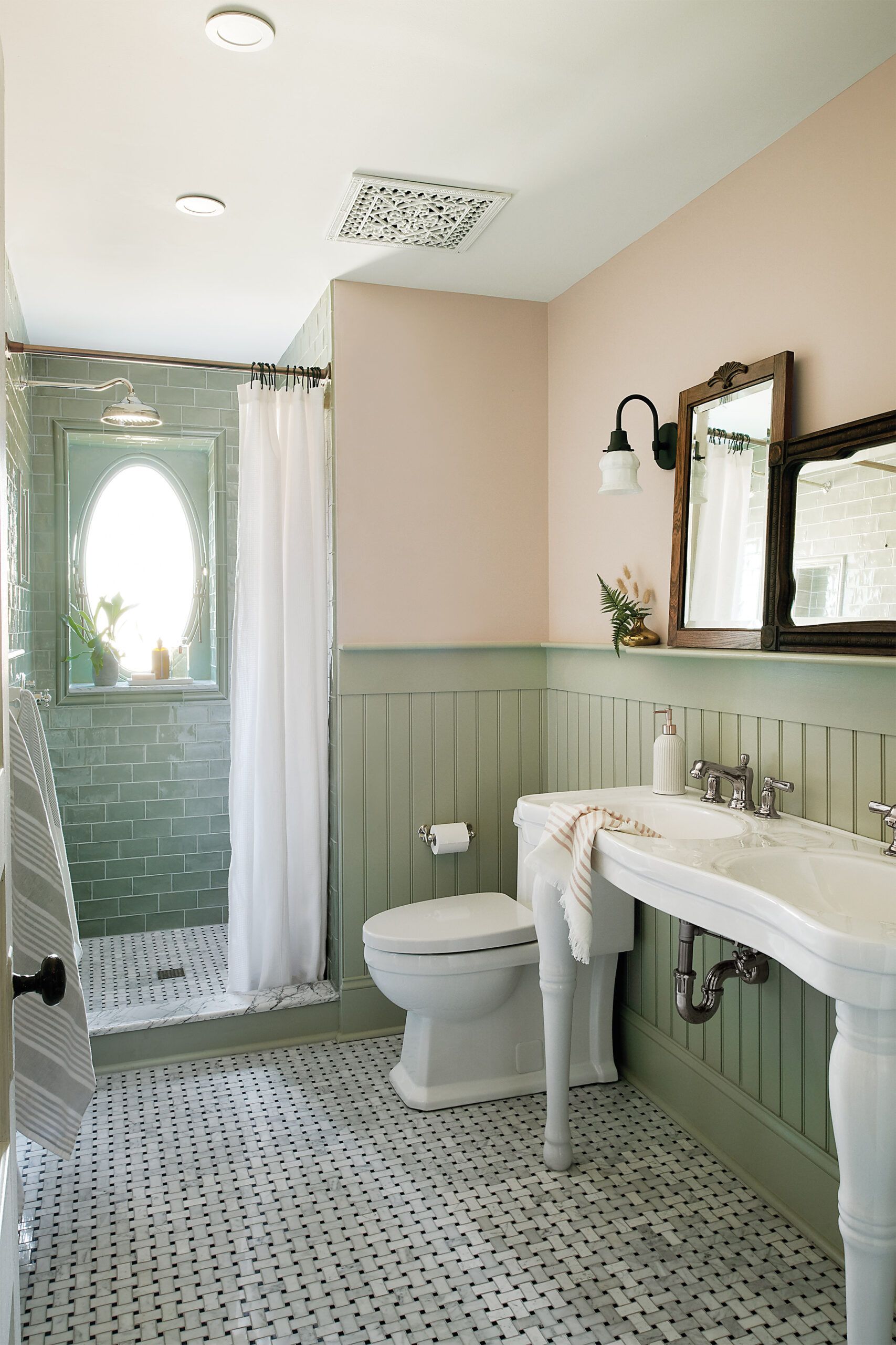
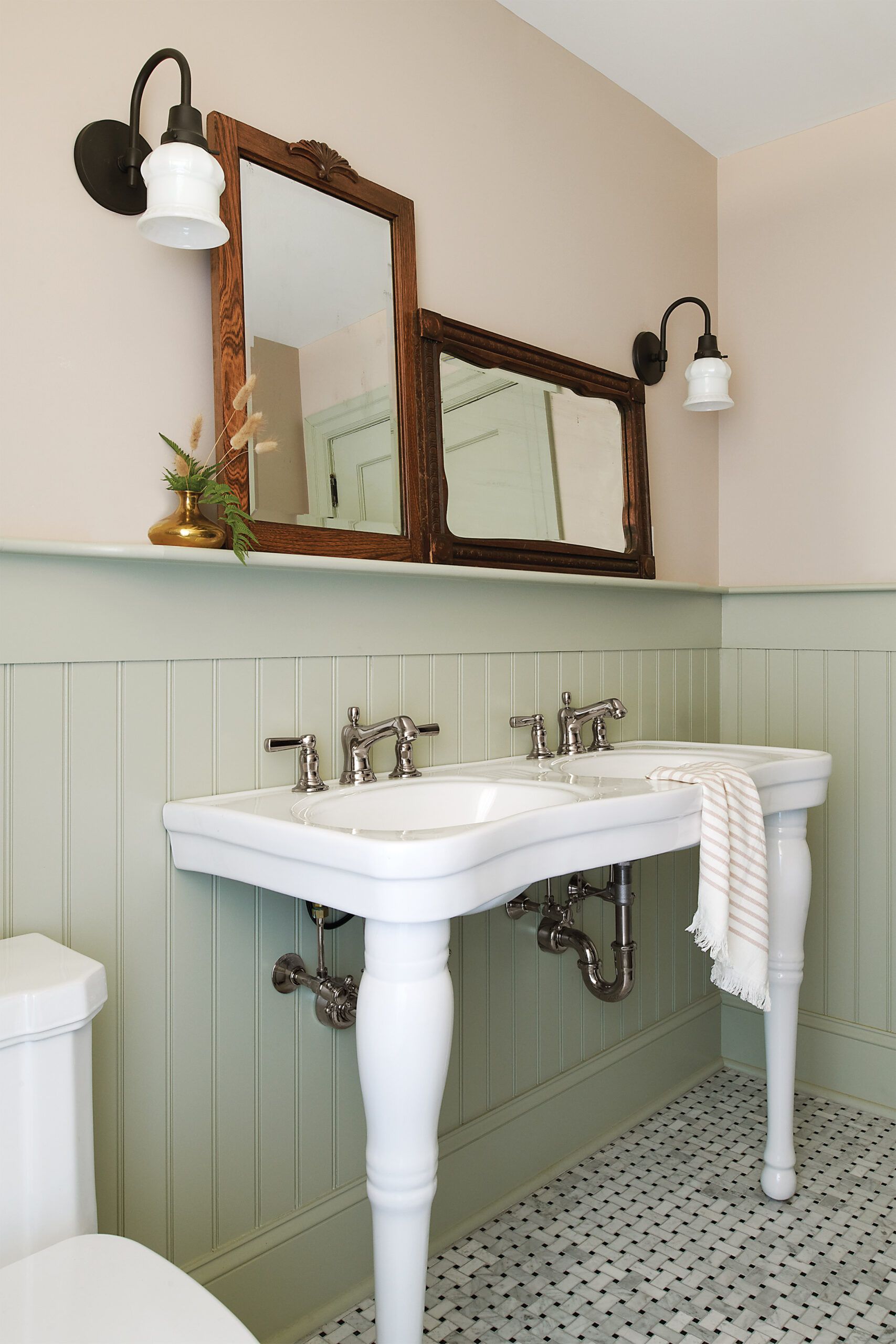
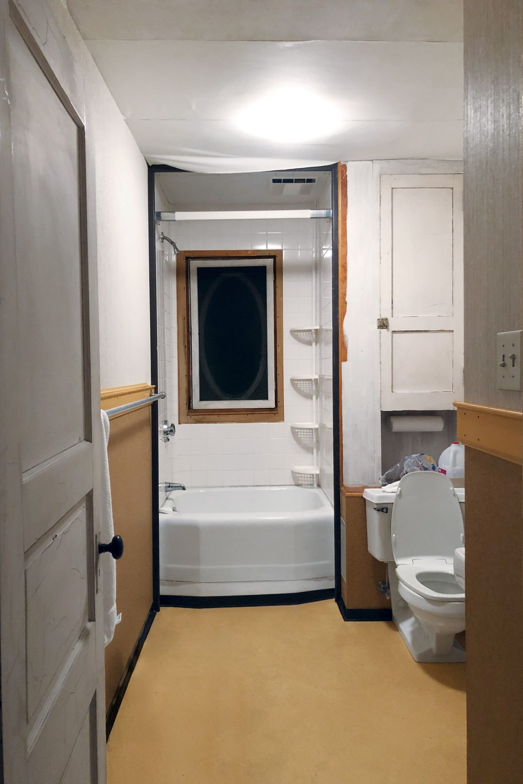


To ensure that the cavalcade of cousins wouldn’t have to settle for a single sink, local designer Nicole Cole devised a plan to steal space from a neighboring bedroom’s closet, which jutted into the room just inside the bathroom door. That allowed her to position an eye-catching double sink on the long side wall, choosing a console model with curvy contours, a style rooted in the 1920s, around the time this home likely got indoor plumbing.
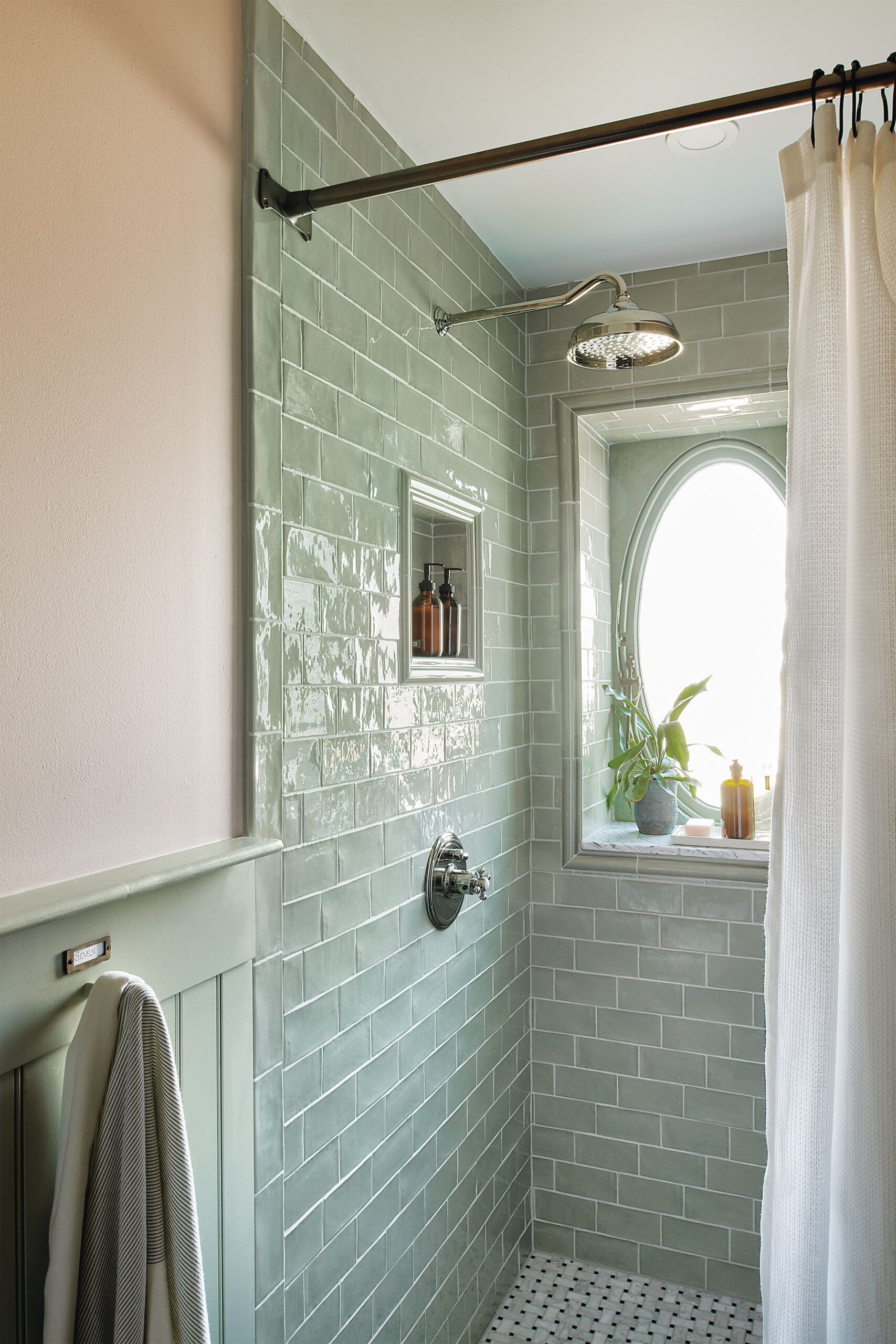
More vintage touches lend a sense of history, including beadboard wainscoting painted a sage green and marble basketweave floor tile—but none more pleasing than the original oval window, previously boxed in behind plexiglass. Updated elements include matte-black sconces with white glass shades and high-shine shower tile with a wavy surface that suggests hand craftsmanship. “You want an old-meets-new balance, rather than a room that looks like it belongs in a museum,” says Cole.
The result? Jenny is delighted with her new-old bath, summing it up this way: “It’s simple, serene, stylish—and it truly respects the house.”
What they did
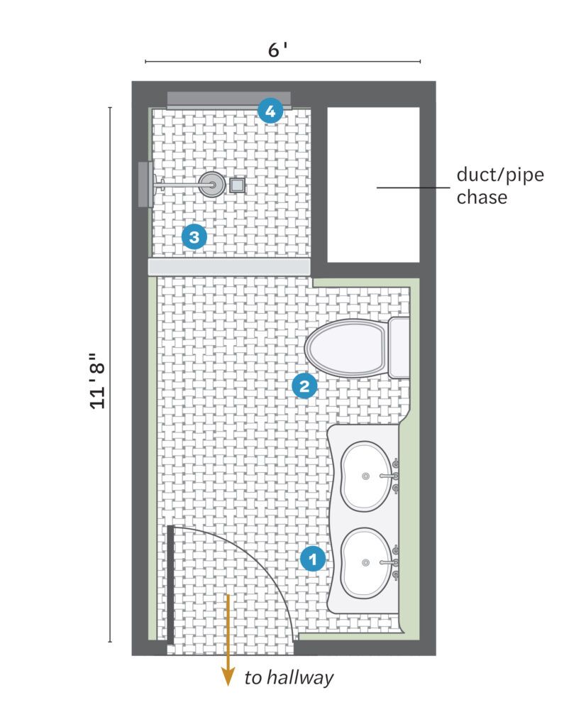
Annexing a bedroom closet that jutted into the room established a rectangular footprint of about 60 square feet.
- Gained about 6 square feet to the right of the entry by grabbing space from the closet next door; this allowed for a double sink along the side wall.
- Rotated the toilet, which had backed up to the HVAC/plumbing chase, 90 degrees to sit along the sink wall.
- Gutted the tub/shower to create a nearly 10-square-foot shower.
- Restored an original window; sloped the tile shelf under it to shed water.
Colored Tile, Floral Wallpaper
In a space-starved bath, practicality has to trump sentimentality. This primary bath, in a 1940s twin home in Ardmore, PA, still bore remnants of its past, namely Art Deco green tile with a black border, flower-flecked wallpaper, a fluted pedestal sink, and a built-in tub. While homeowner Nancy Gore appreciated the original finishes, including that tile, the overall design of the 5 6-square-foot space left much to be desired. “The shower was tiny, the tub was never used, and there was virtually no storage,” she says. “I wanted to re-create some vintage style while making the bath more functional.”
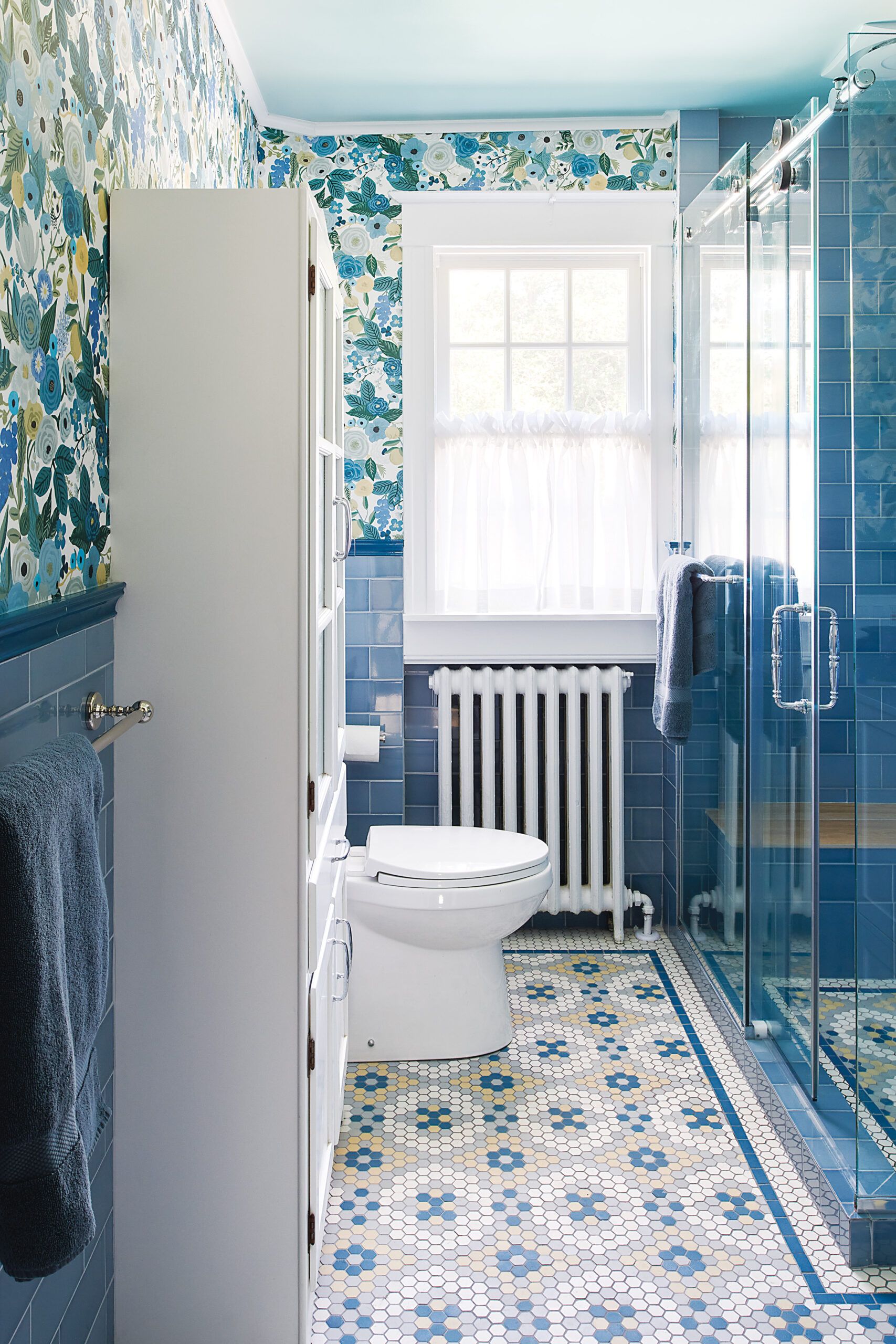
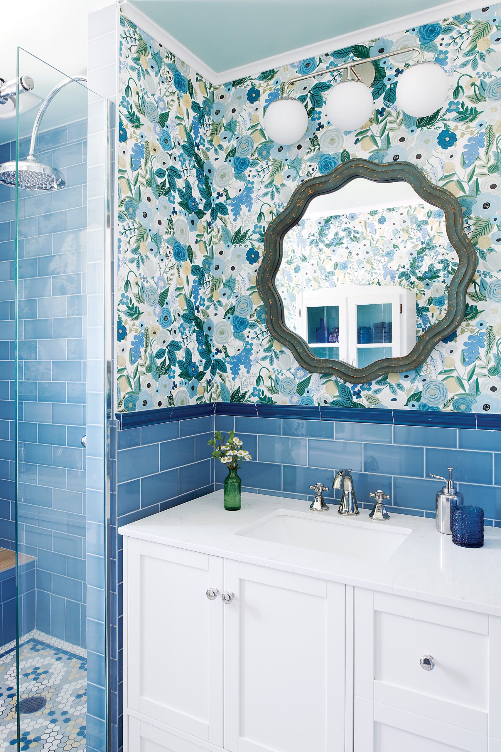
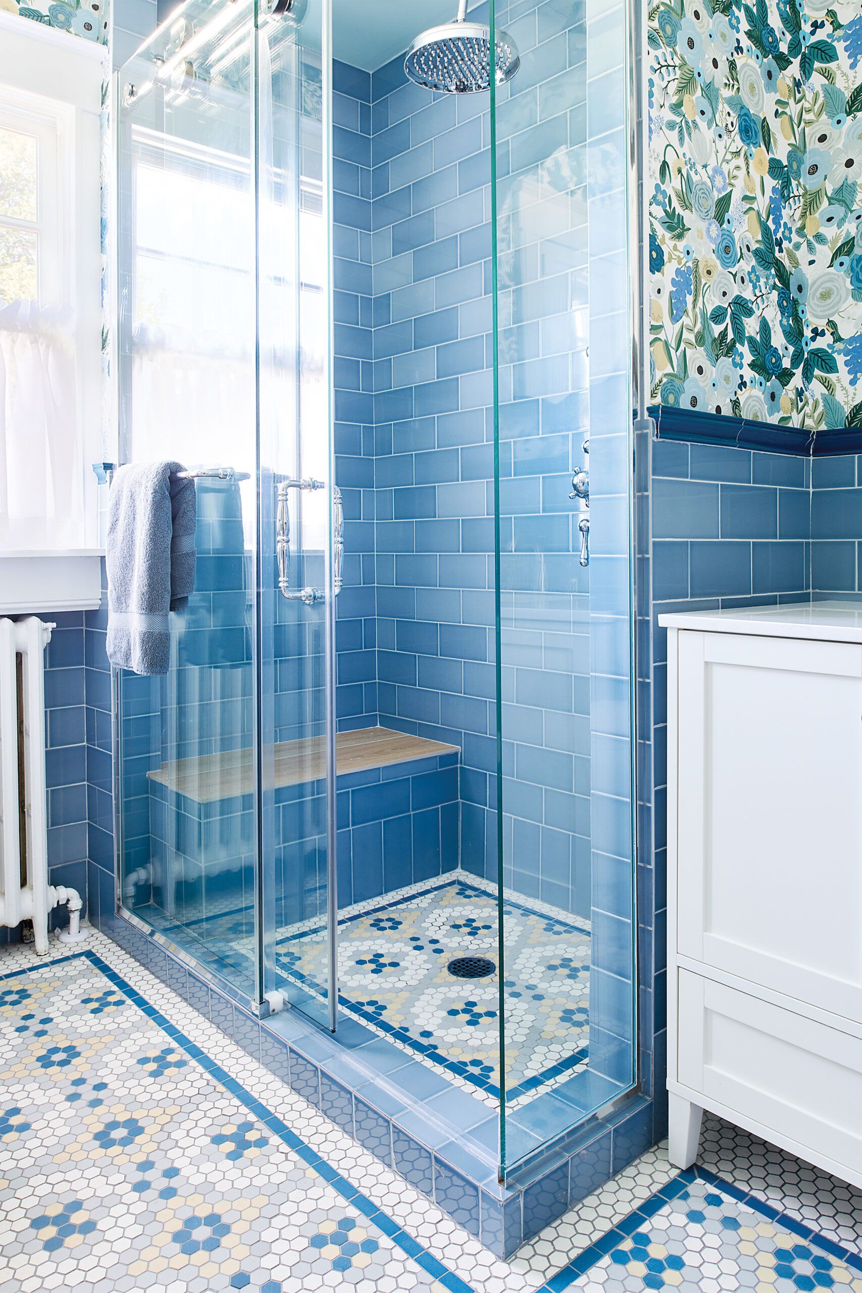
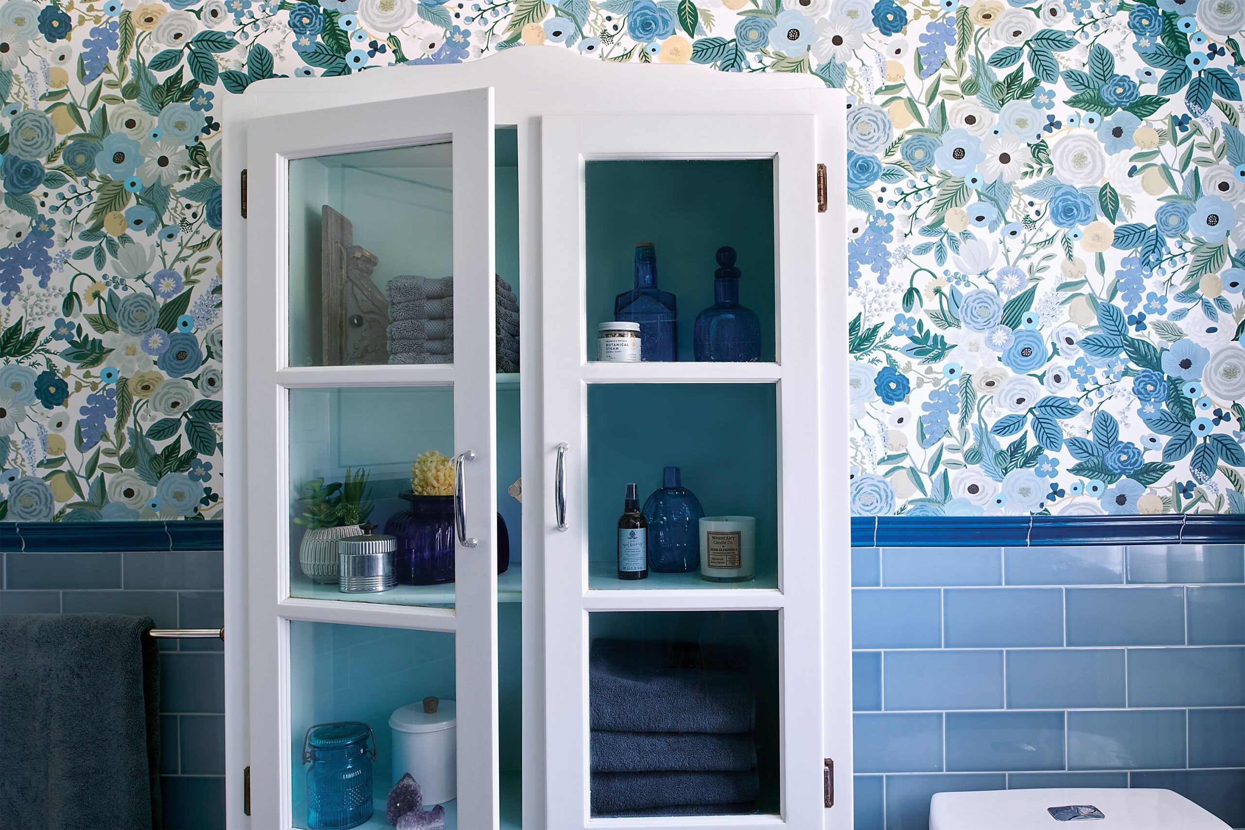
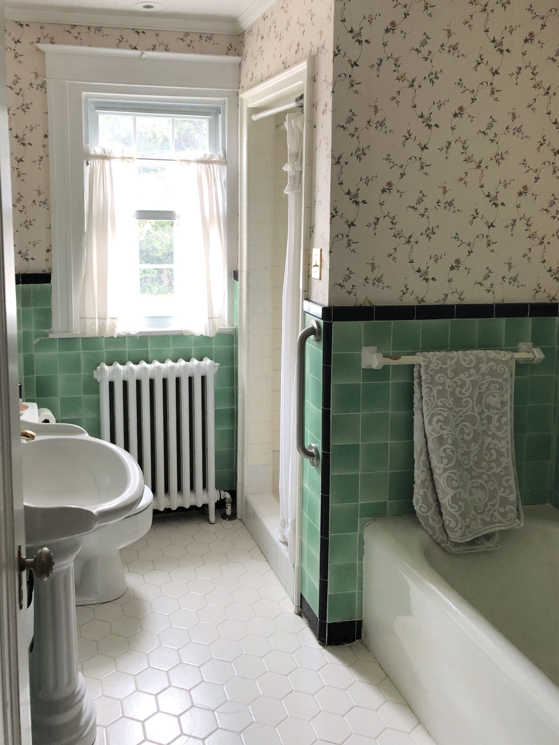


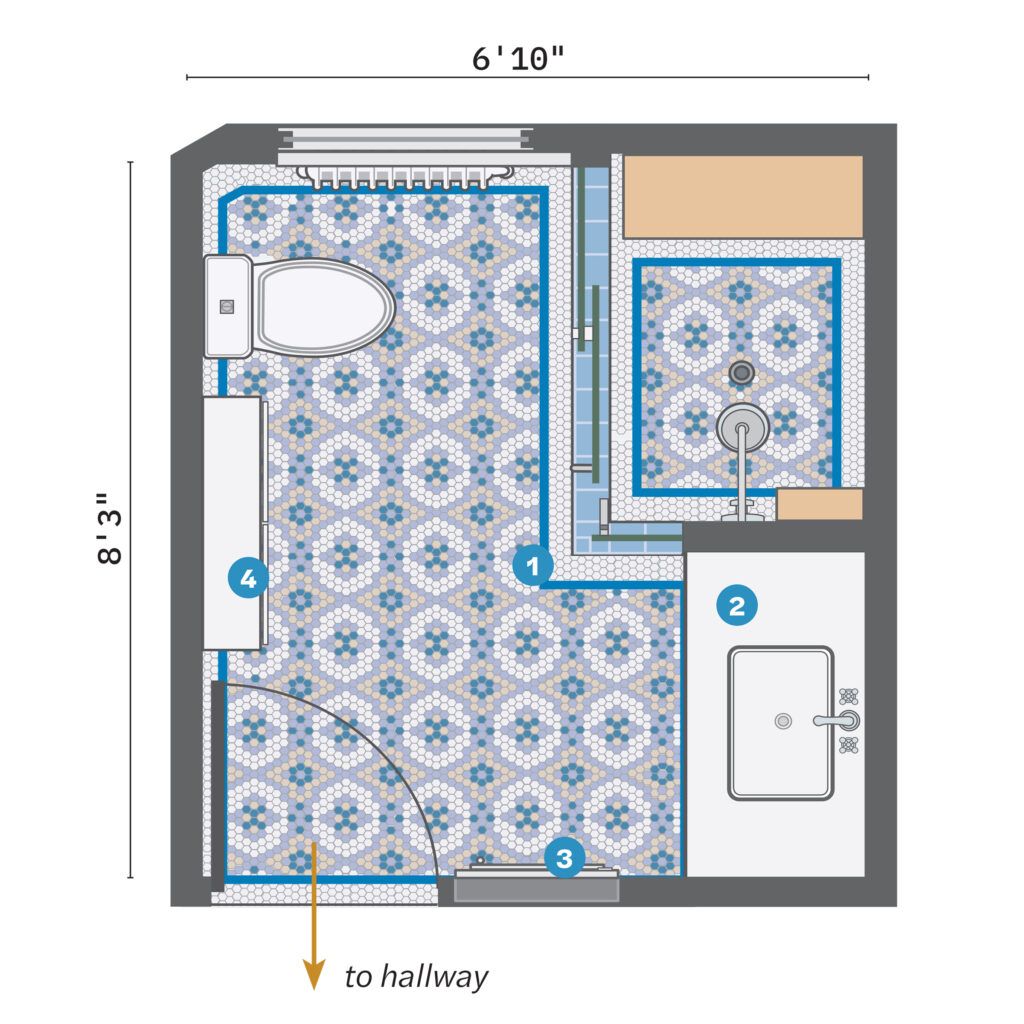
Agreeing to scrap the tub freed designer Sean Lewis to widen the shower alcove by an extra 16 inches. To add needed storage, he moved the sink to the opposite wall, setting it in an ample vanity. A shallow hutch where the sink had been provides a place for linens. With the space reworked to maximum advantage, Nancy and Lewis turned their attention to the fun stuff, choosing soothing blue subway tile for the lower part of the walls with a darker chair rail above, and colorful penny tile on the floor in a decorative pattern that also has a border—both updated takes on tilework that reflect the room’s roots. Add in a lively, modern floral paper on the upper walls that ties the color palette together, and you’ve got a hardworking room wrapped in uplifting color.
With more room to move and space for her stuff, Nancy can now truly enjoy time spent there: “It has the beautiful vintage look I wanted,” she says. “I love the cheerful colors, the freshness—and being able to shave my legs without hitting my head on the wall!”
What they did
Widening the shower and adding streamlined vanity storage helped the 56-square-foot space work harder.
- Scrapped an alcove tub and extended the shower by about 16 inches, keeping the plumbing in the partition wall and adding a built-in bench and open shelves.
- Moved the sink to where the tub had been, fitting in a 45-inch-long vanity with door and drawer storage.
- Refinished an existing built-in wall cabinet to function as a medicine cabinet for the sink.
- Kept the toilet in its location and added a shallow salvaged hutch to one side, in the sink’s old spot, to hold linens and toiletries.
A Copper Claw-Foot Tub
A vintage-style bath doesn’t have to reflect the era when the house was built. Take the guest bath in
this 1950 ranch house in Austin, TX, where the original 4-by-4-inch tile and basic fixtures simply didn’t suit
the homeowner’s taste. “I wanted higher-quality components with Victorian style, like a claw-foot tub,”
says Austin Bolen, who took his inspiration from fond memories of his grandparents’ house, an American Foursquare, where the bath had one of those classic cast-iron soakers.
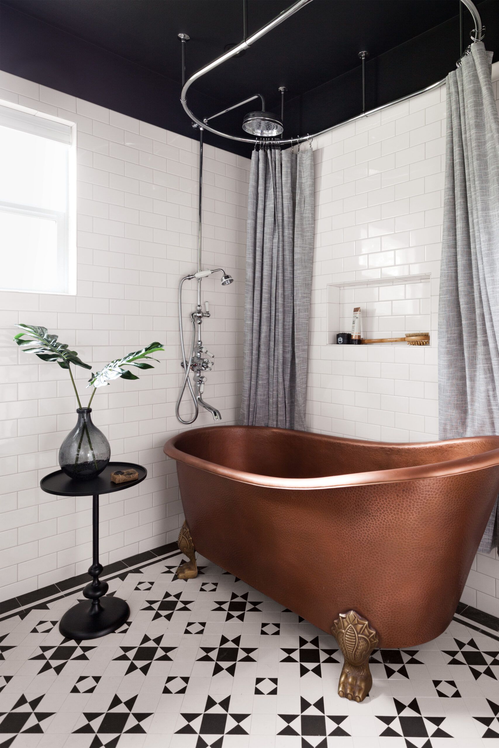
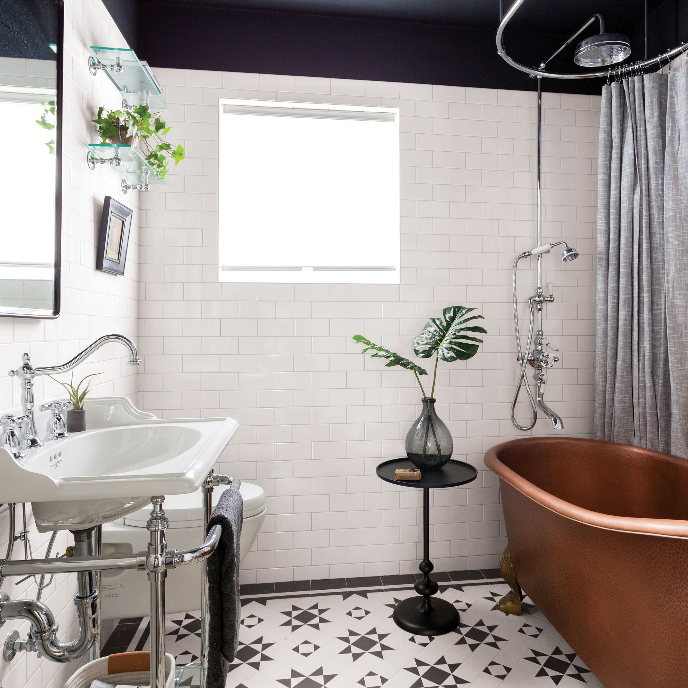
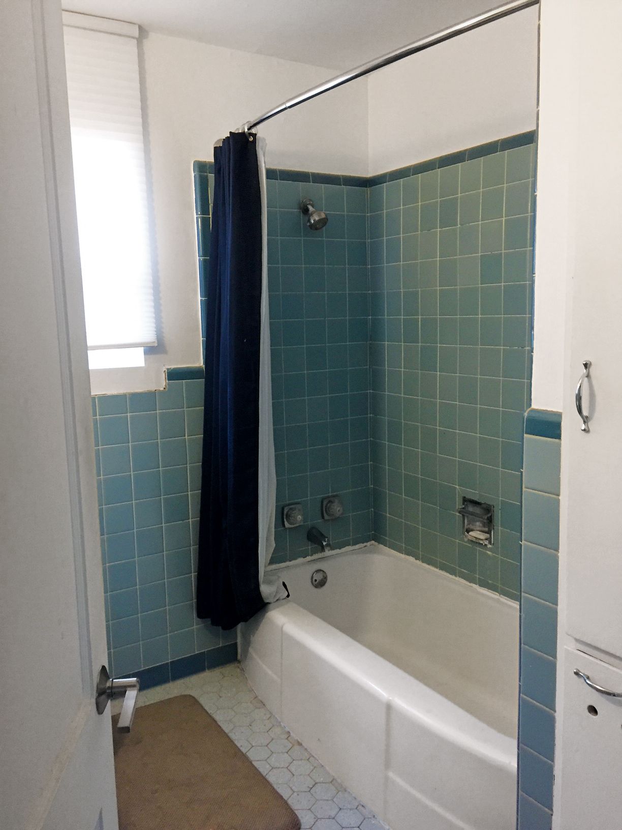


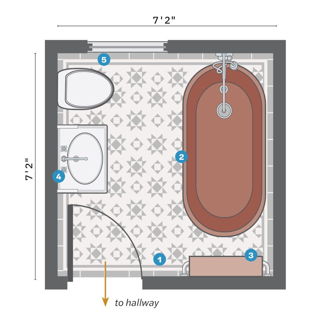
So designer Erin Williamson built Austin’s ideal bath around a fresh take on the claw foot, a copper
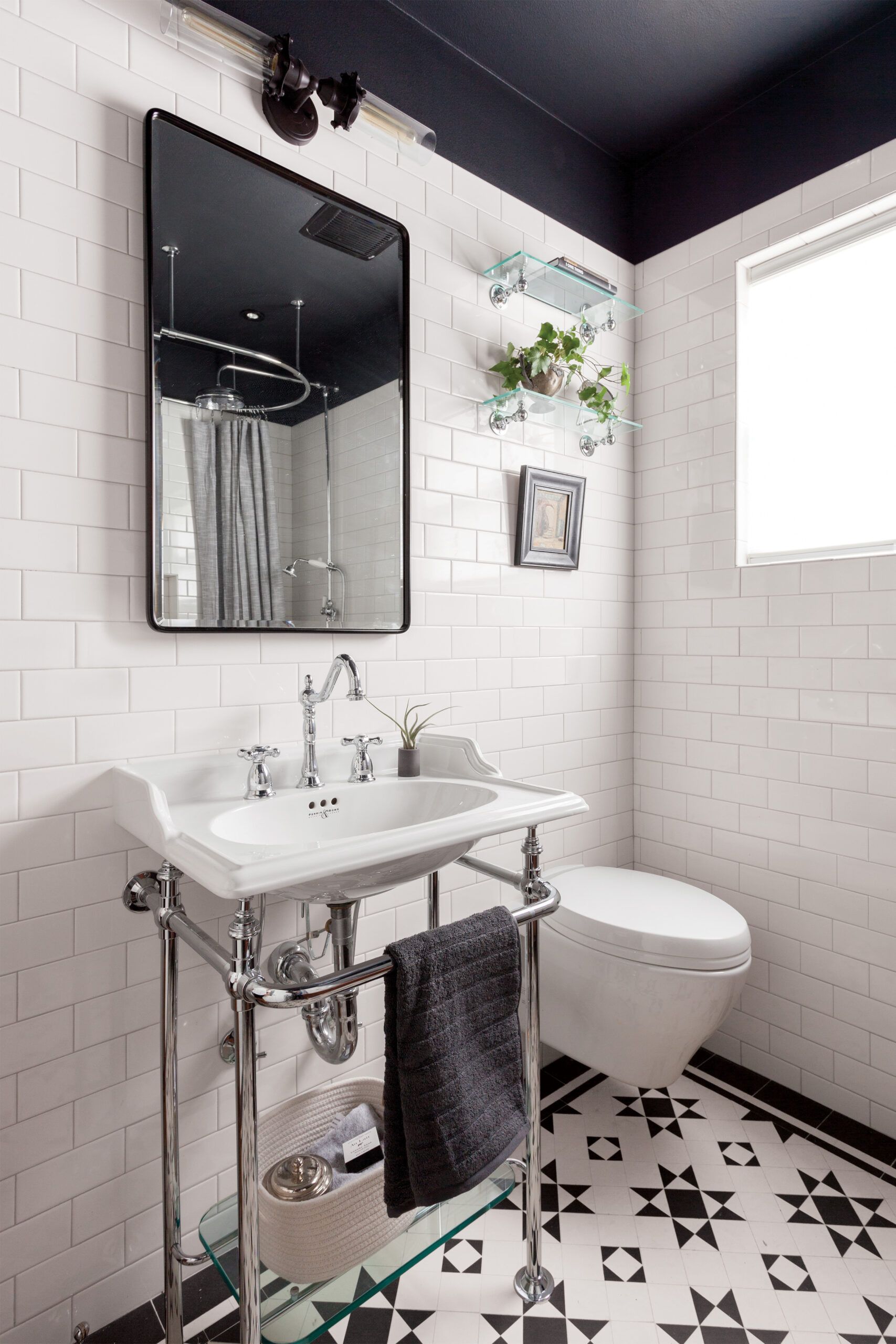
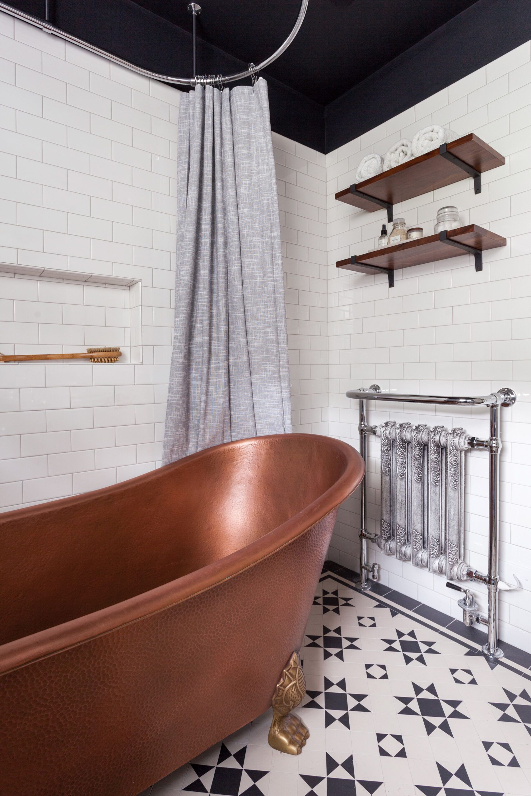
model that really amps up the drama with a textured finish and brass feet. To comfortably accommodate the longer, wider tub, she snagged 6 square feet by removing a built-in linen closet, and another 10 inches of floor space by replacing the toilet with a version that has a tank that recesses into the wall. “A minimum of contrasting elements is best in a small space,” says Williamson, so she kept the rest of the room fairly spare: white-subway-tile walls, a washstand-style sink on chrome legs, and an unfussy mirrored medicine cabinet. Painting the ceiling black was a bold move that actually amps up the feeling of coziness in the white-walled room. The result has more than met Austin’s expectations: “The space is a lot more open and looks great,” he says, adding, “Even though it’s the guest bath, I love to use that tub!”
What they did
Ditching a linen closet and a vanity made way for a larger tub and storage that suits a 51-square-foot guest bath.
- Scrapped a built-in closet to access 6 square feet inside the doorway.
- Swapped an alcove tub for a 65-inch-long claw-foot soaker, building in a 12-by-24-inch wall niche alongside; an exposed shower riser and tub filler went in on the already-plumbed wall.
- Hung a Victorian-style wall-mounted radiator with a heated towel bar at the
- head of the tub with open shelves above.
- Removed a vanity cabinet and installed a console sink with a shelf.
- Replaced a standard toilet with a wall-hung model with the tank recessed into the wall, gaining about 10 inches in front for a total of 32 inches of clearance from the tub.
