Bold color combinations can breathe new life into tired rooms, transforming your living spaces with vibrant energy and personality. Whether you’re looking to make a dramatic statement or create a subtle and harmonious flow throughout your home, strategic use of color can achieve remarkable results.
We’re sharing some of our favorite techniques for using bold colors in interior design, from accent walls to ceiling treatments.
How To Choose Colors
A fresh paint job spices up a ho-hum interior, but picking the right colors and figuring out where to put them can be hard. To narrow your choices, break out a color wheel. Paint pros use this tool to see how colors will look together before they pick them. Hues that are next to each other on the wheel, such as yellow and green, make pleasing pairs, as do shades of complementary colors, which are found on opposite sides of the wheel.
To judge where and how much, try the 60-30-10 rule: “Basically, you use a dominant color for 60% of the room, a recessive one for 30, and an accent for 10,” says color expert Debbie Zimmer of the Paint Quality Institute. For a whole-house scheme, Zimmer suggests using the same three colors but varying which play the starring and supporting roles.
If you’re thinking on a smaller scale, try adding a single dose of a color you love to just one element in a room, such as the inside of a built-in bookcase. “Painting one surface or an interesting architectural detail is such a great way to get some bold punch,” says Ann McGuire, a color consultant for Valspar and founder of Beehive Studios.
Below, we put more paint tips to work in 15 colorful spaces.
Unify Your Living Spaces
Create a cohesive flow between rooms for a harmonious look. Wall colors that relate to each other can guide the eye from one area to the next, establishing a sense of continuity throughout your living spaces.
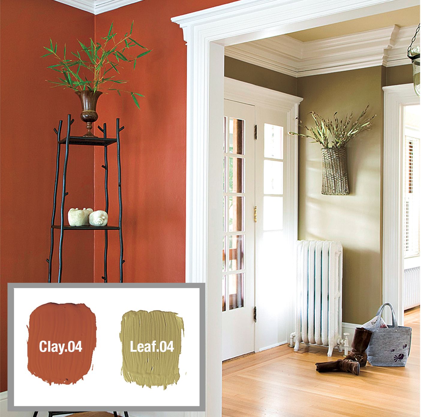
Try Muted Opposites
One way to achieve this unity is by using muted shades of complementary colors in adjacent rooms. For example, pairing a soft brick red in an entry hall with an olive green in the adjoining room creates a soothing effect while maintaining visual interest. When combined with warm wood tones, such as a honey-hued floor, these earth-inspired hues can act as sophisticated neutrals.
To further enhance the unity, try coordinating the décor and accessories in both spaces. Details such as throw pillows, rugs, and artwork can carry the color theme throughout your home.
Use White To Highlight Your Color Choices
White trim is as an excellent frame for your color choices, enhancing both warm and cool hues. As McGuire notes, “Painting trim white will ensure that warm hues don’t look dingy or cool hues too stark.” This is particularly effective when working with colors that are neighbors on the color wheel.
White door casings and trim can act as a clean, crisp border, beautifully setting off contrasting colors in adjacent rooms. For instance, a warm yellow dining room can transition smoothly to a cool green foyer when separated by white trim. It creates a visual distinction between the spaces.
Experiment with different shades of white to complement your color scheme. Bright white can lend a contemporary feel, while a softer, creamy white can add warmth to the space.
Paint: Valspar
Create an Accent Wall
An accent wall is a powerful tool for highlighting a room’s best features. By focusing color on a single wall, you can create a focal point that draws the eye and adds depth to the space.
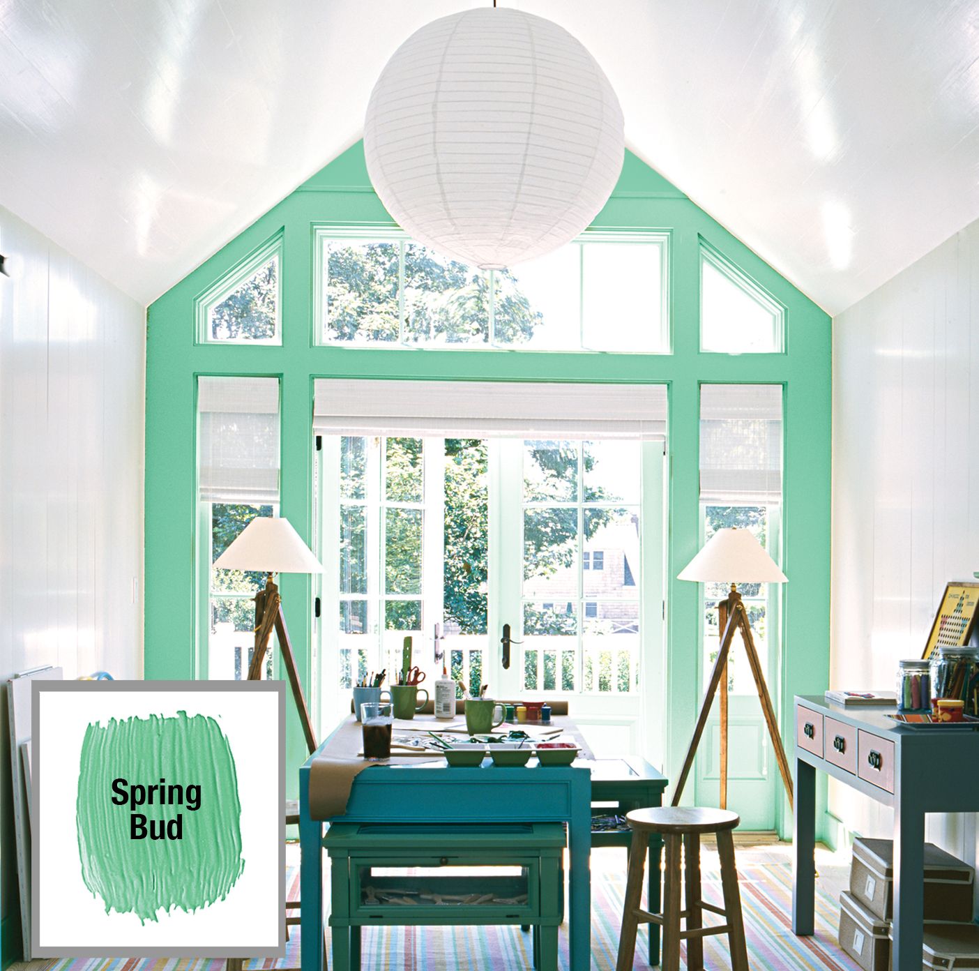
Use Color To Highlight Architecture
When selecting a color for an accent wall, consider the room’s natural light and existing features. In spaces with ample natural light, such as a studio with large windows or French doors, a vibrant hue can make an impact without appearing overwhelming. For example, painting the exterior wall of an all-white studio a leafy green emphasizes the room’s peaked ceiling and creates a visual connection to the outdoor views.
Another approach is to use color to enhance unique architectural elements such as alcoves, niches, or built-in shelving. Highlighting these areas with bold colors can add character and dimension.
Paint: Pantone
Set a Stage With Paint
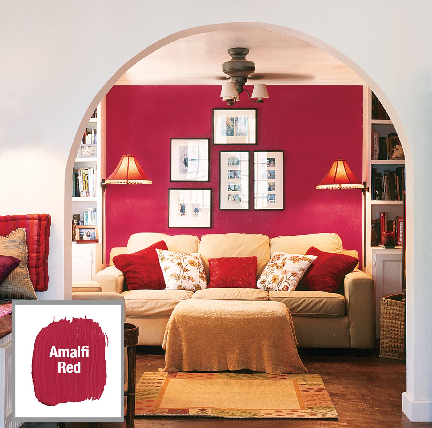
A deep, rich color can serve as an excellent backdrop for showcasing artwork, collections, or statement furniture pieces. As McGuire says, “A deep color becomes the backdrop for whatever is in front of it.” This is effective when you want to create a warm, energizing atmosphere but maintain a neutral overall palette.
For instance, a bold red accent wall can provide the perfect canvas for displaying a collection of framed photographs or artwork. The red draws attention to the displayed items and offers a striking contrast to neutral furnishings, adding depth and visual interest to the room. This can be applied to various other spaces, such as hallways or staircases.
Paint: Ralph Lauren Paint, Ralph Lauren Home
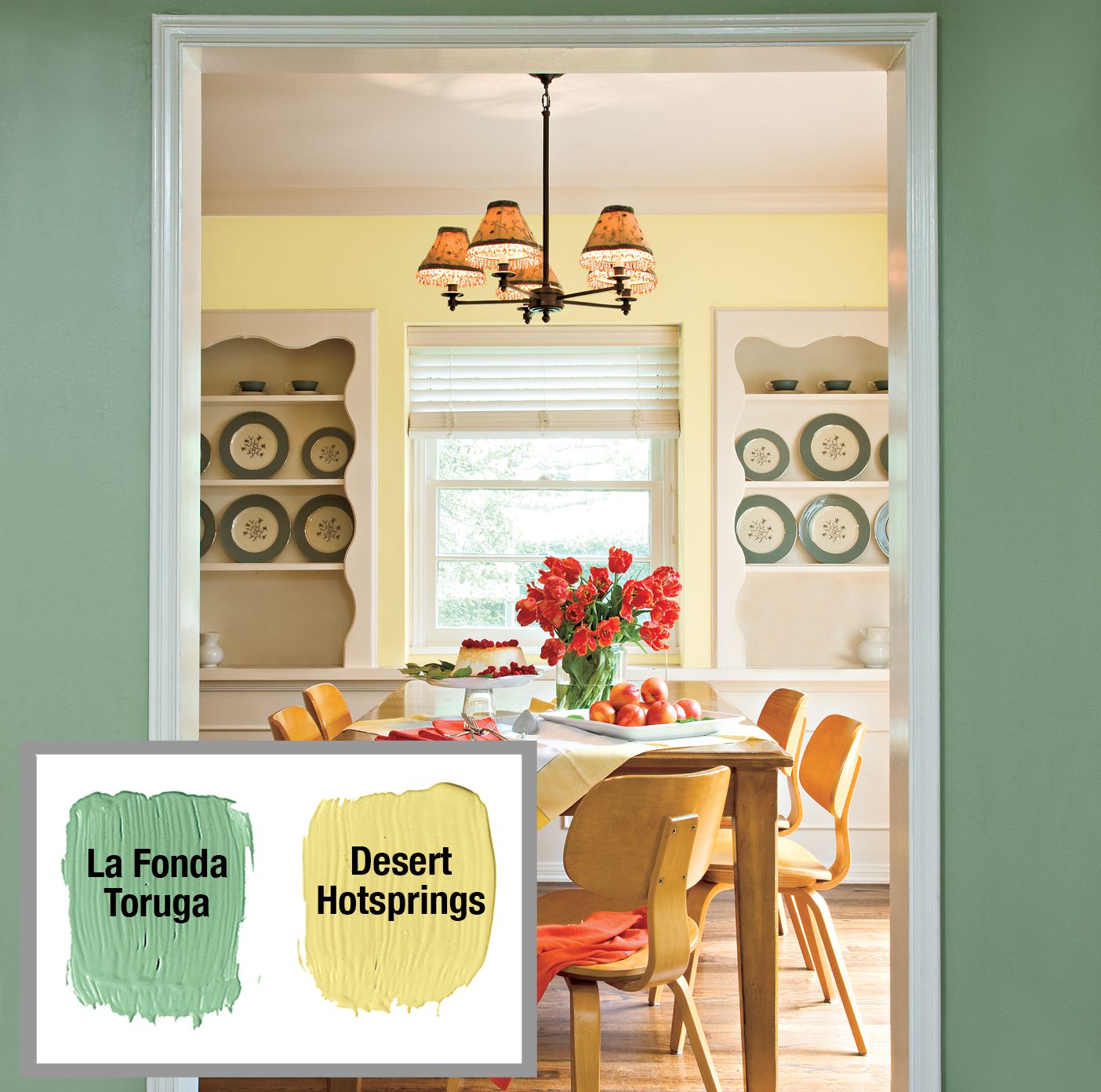
Define an Area in an Open Plan
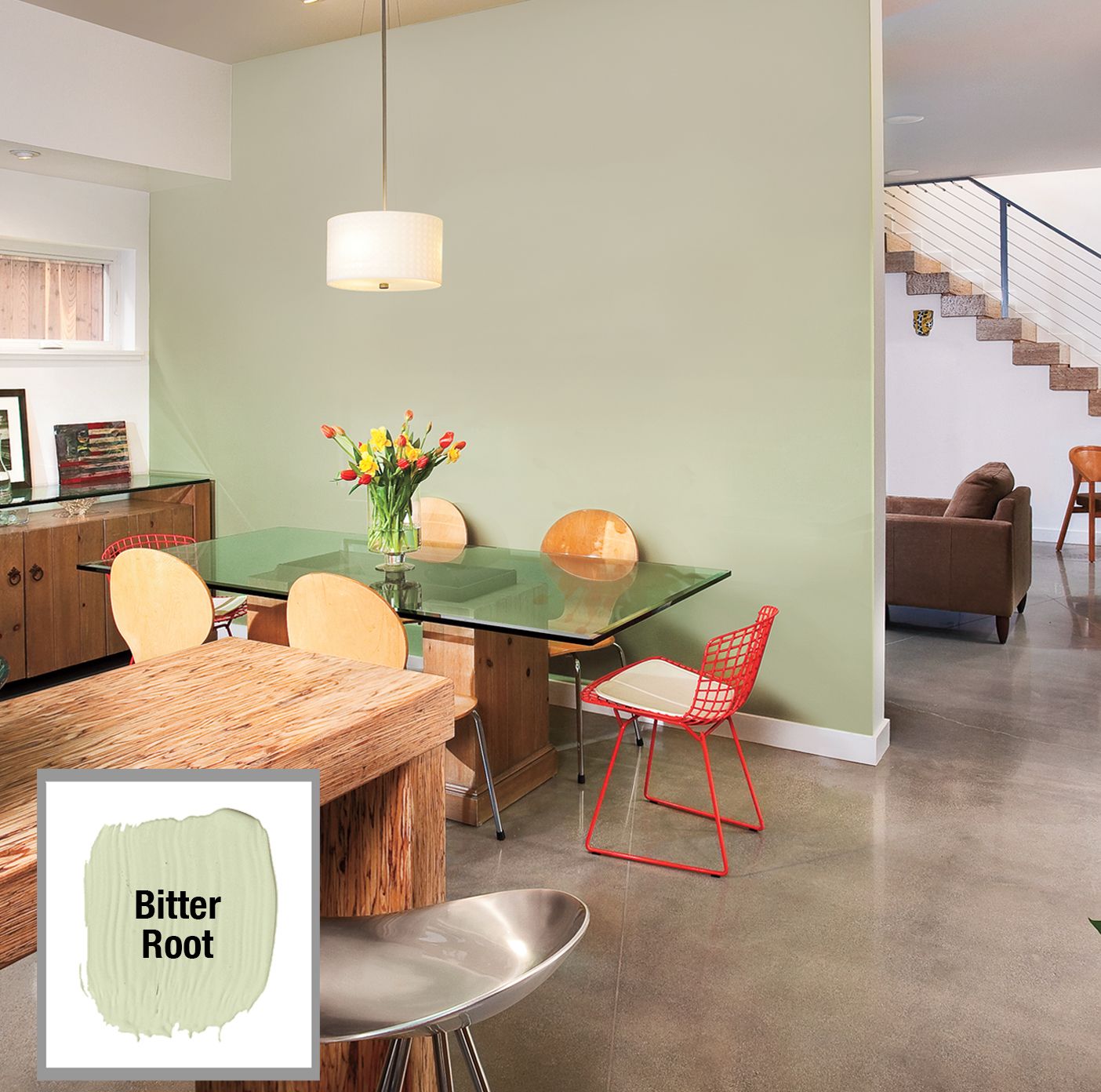
In open-concept spaces, color can delineate specific areas without the need for physical barriers. We like this technique for creating distinct zones within a larger space, such as carving out a dining area within an open kitchen.
By applying a different color to the wall behind a dining table, you can visually separate the eating area from the rest of the kitchen. A grayish-green shade, for example, can provide a subtle yet effective boundary. The color helps to focus attention on the dining space while maintaining the overall open feel of the room.
Use furnishings and accessories in coordinating colors to reinforce this separation. Matching chairs, tablecloths, and pendant lights can further define the dining area for a cohesive and intentional design.
Paint: AFM Safecoat
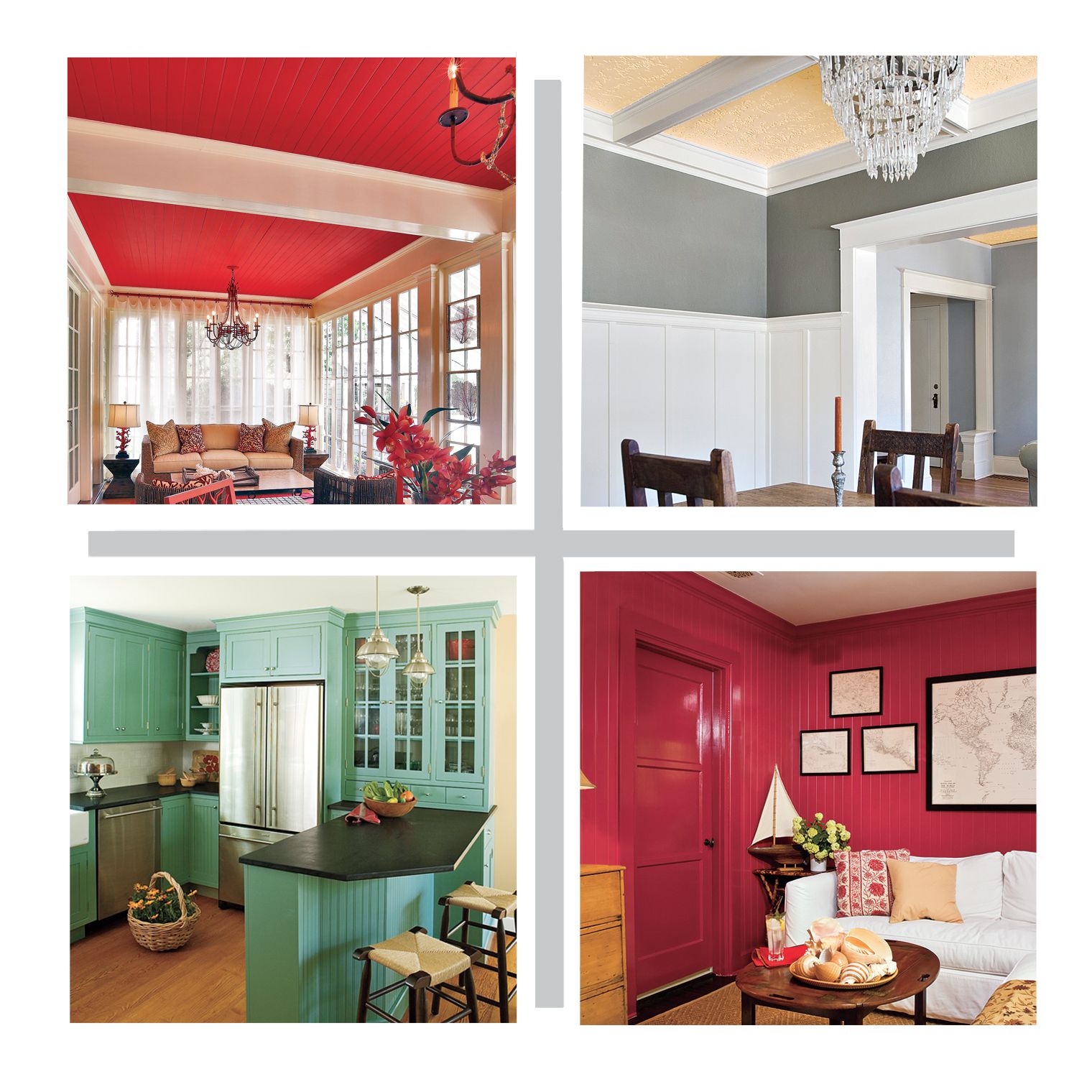
Play Up Ceilings
While white ceilings are a common choice for creating an airy feel, introducing color to this often-overlooked surface can add unexpected personality and comfort to a room. Colored ceilings can enhance architectural features, create the illusion of height, or add a cozy ambiance to a space.
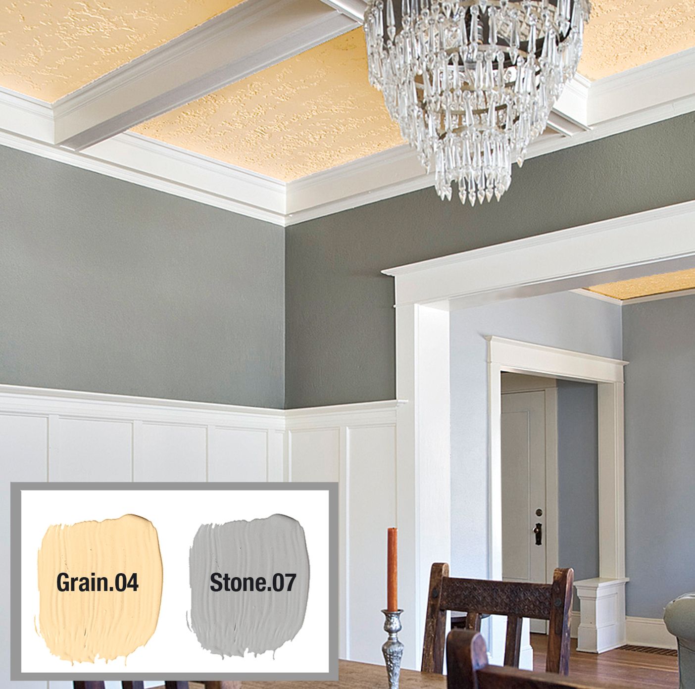
Maximize a Lofty Look
In rooms with coffered ceilings, painting the recessed areas a rich color can amplify the sense of height and add visual interest. For example, a golden yellow applied to the inner trays of a coffered ceiling can create depth and warmth, while a tall white wainscot draws the eye upward to emphasize the room’s height. Complementing this with a band of cool silvery gray on the walls provides a balanced contrast to the warm ceiling tones.
Another way to maximize a lofty look is by extending the ceiling color down onto the walls, emphasizing vertical lines and elongating the room’s appearance. This can create a dramatic and cohesive effect.
Warm Up Walls of Windows
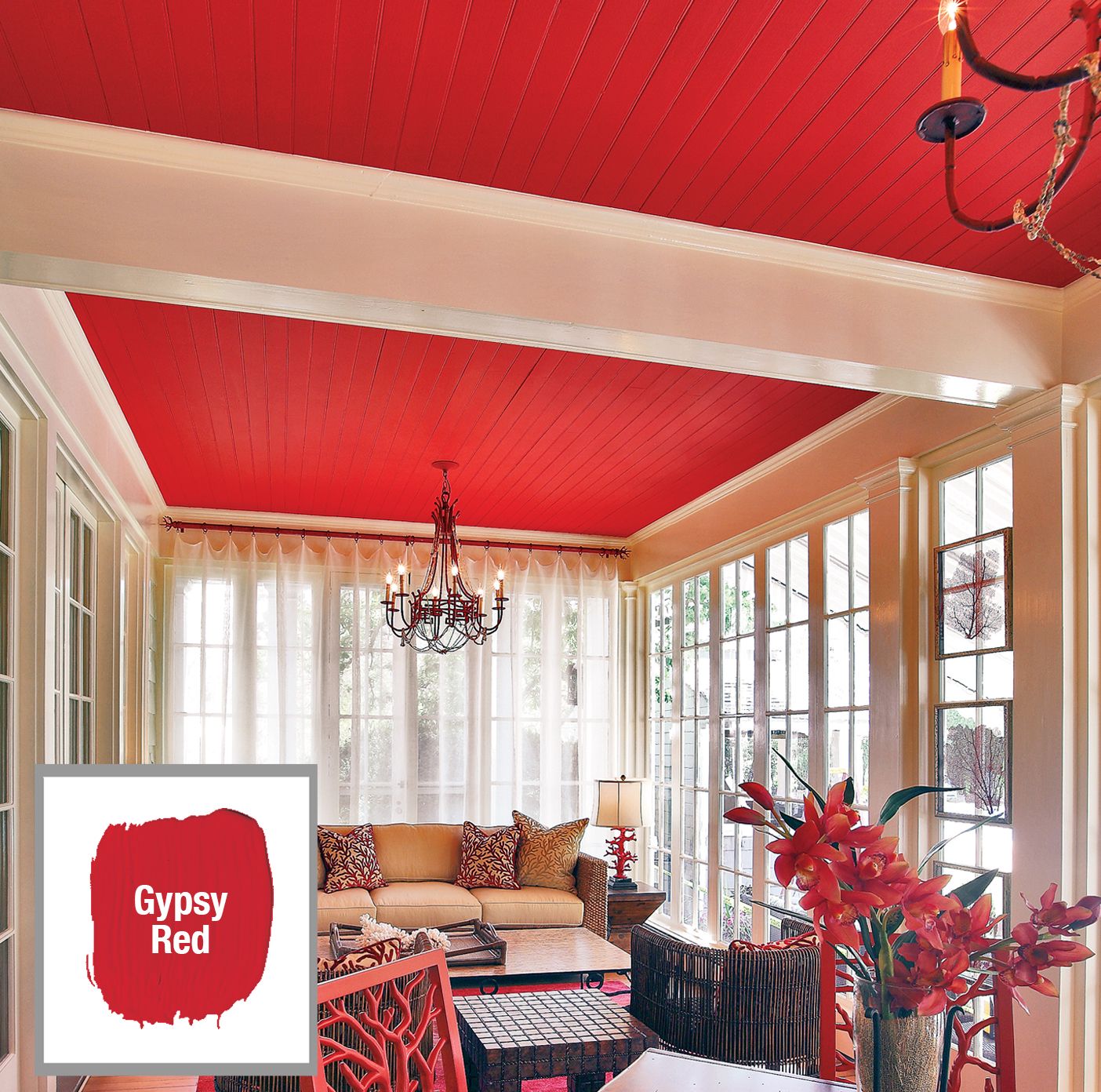
Rooms with extensive glazing can sometimes feel cold or impersonal. Introducing a warm color to the ceiling can help counteract this effect, creating a more inviting atmosphere. A bright red ceiling, for instance, can visually lower the perceived height of a glass-walled room. This makes it feel cozier and more intimate.
To reinforce this warming effect, echo the ceiling color in your choice of accessories and furnishings. Red area rugs, chairs, and table lamps can create a uniform look that ties the room together from floor to ceiling. Combining warm ceiling colors with textured window treatments, such as curtains or blinds in complementary colors, can also enhance the room’s overall warmth and comfort.
Paint: Sherwin-Williams
Be Bold in the Kitchen
The kitchen, as a hub of activity and gathering, is an ideal space for experimenting with energetic color schemes. Moving away from traditional all-white kitchens can infuse the space with personality and vibrancy.
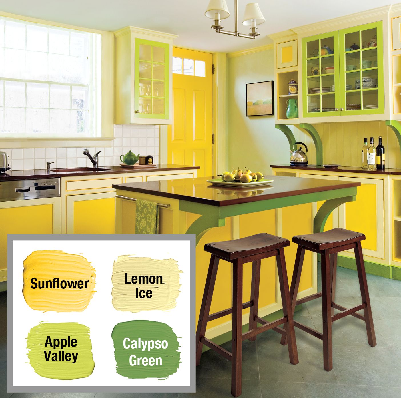
Go for Shades of Equal Intensity
When working with multiple colors in the kitchen, using hues of similar saturation can create a dynamic but balanced look. For example, pairing a saturated daffodil yellow on base cabinets with apple green on upper cabinets and grass green on decorative brackets can give you a lively and cohesive design. To maintain harmony, you might choose a lighter tint from the same color family for trim or accents, such as a lemony shade to complement the bolder yellows and greens.
Incorporating vibrant accessories like colorful kitchen towels, utensils, and small appliances can add to the energetic atmosphere.
Paint: Glidden
Focus on a Dominant Color With Neutrals
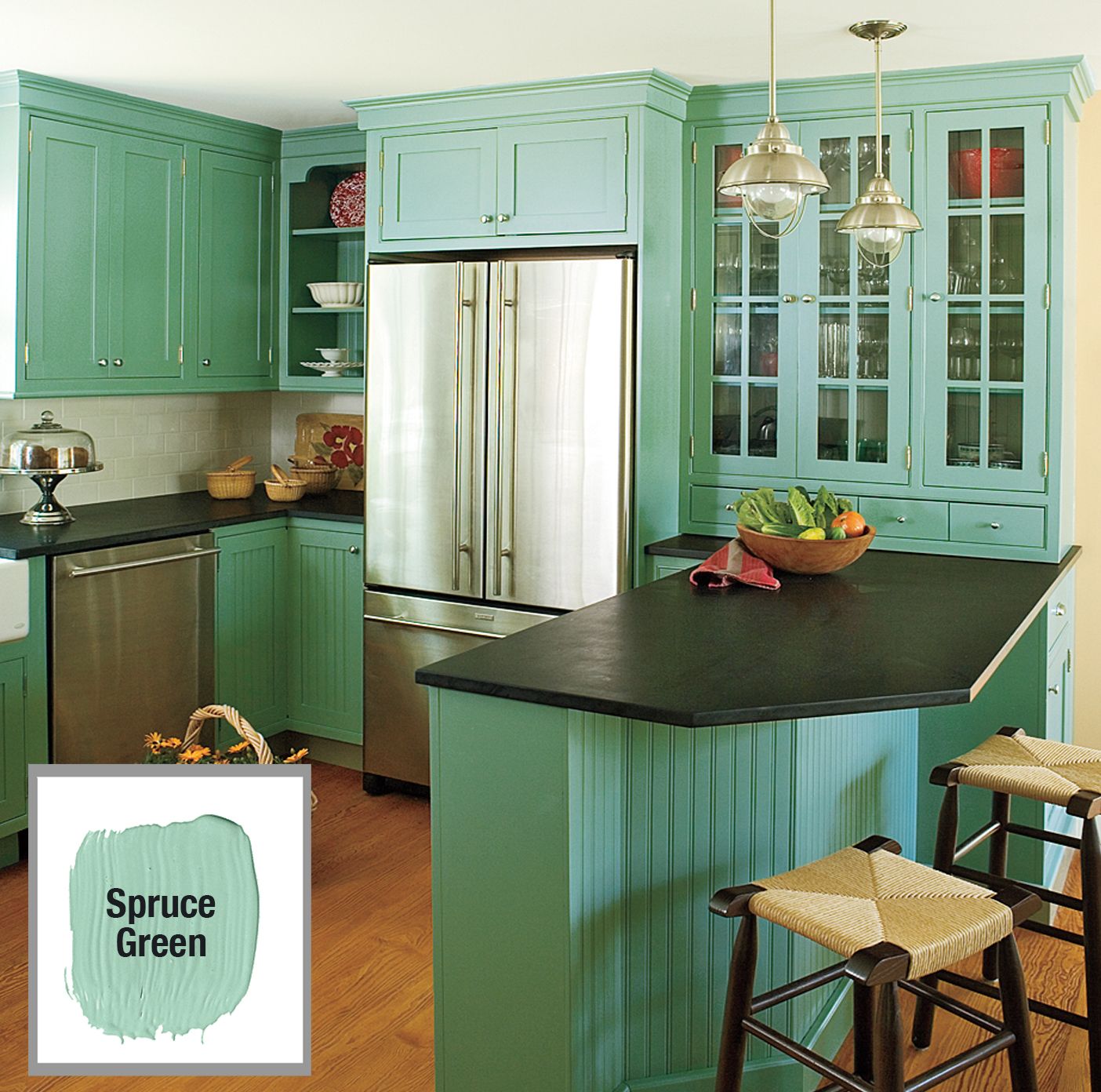
Another approach to kitchen color is to select a dominant hue and pair it with neutrals. This strategy allows you to make a bold statement while maintaining a sophisticated, timeless look. For example, a vibrant green on cabinetry can become the focal point of the kitchen when set against beige walls and caramel-toned flooring. The warm undertones in these neutral elements help to bring out the richness of the green.
To modernize this color palette, incorporate black countertops and stainless-steel appliances. These sleek, contemporary elements provide a contrast to the more traditional cabinet color for a kitchen that feels both classic and current.
Think about adding natural elements like wooden cutting boards or stone countertops to create a balanced blend of bold and organic textures.
Paint: Olympic
Use the 60-30-10 Rule
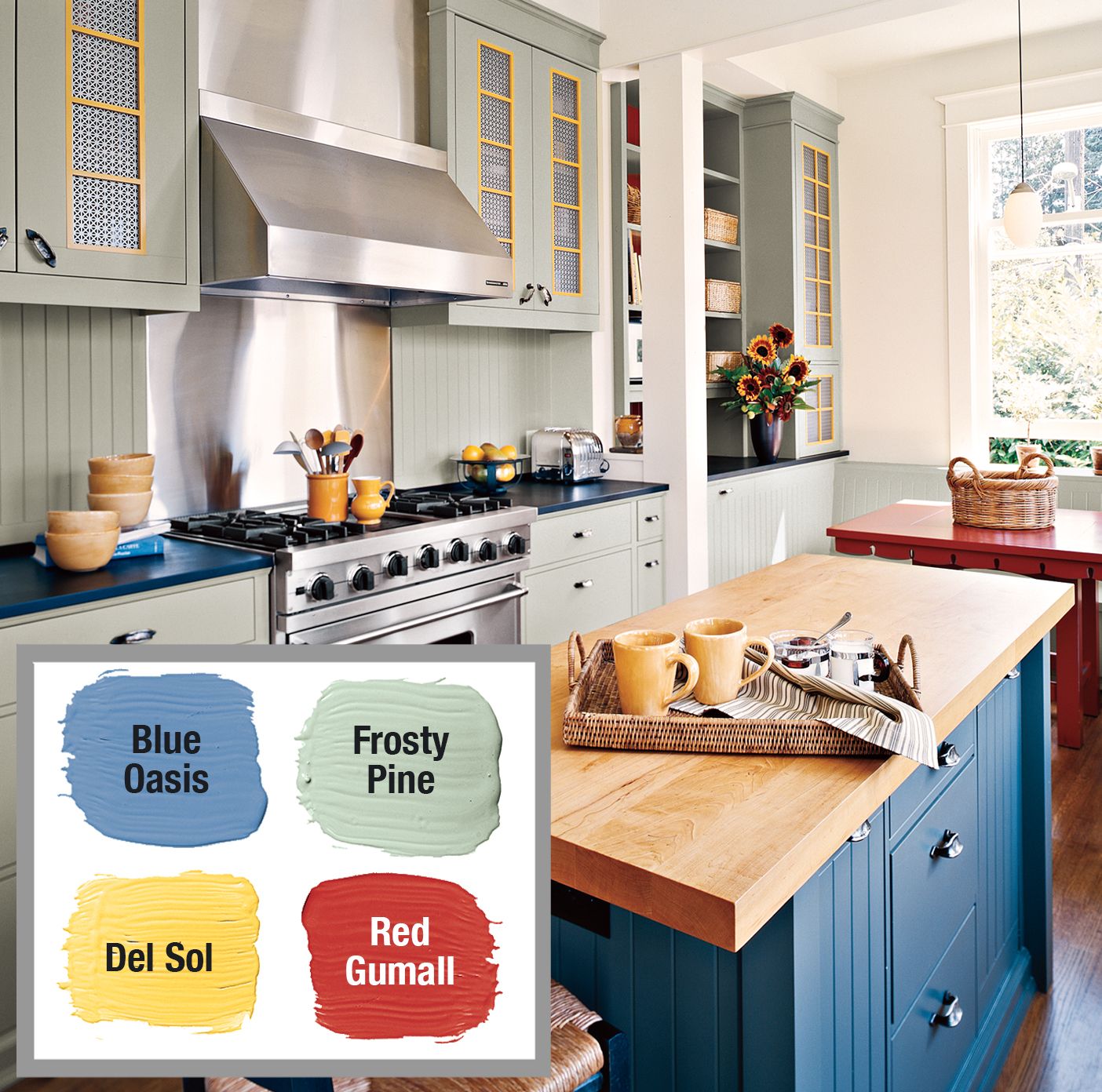
The 60-30-10 rule we introduced above is a classic interior design principle that can help create a well-balanced color scheme in any room, including the kitchen. In a kitchen setting, you might apply the rule by using gray-green paint on cabinetry as your dominant color (60%), highlighting the center island in blue for your secondary color (30%), and adding pops of red and yellow as accents (10%) through elements like a dining table or window muntins.
Complementing the color distribution with coordinating tableware, cookware, and decorative elements can tie the whole design together.
Paint: Benjamin Moore
Brighten Built-ins
Built-in elements offer excellent opportunities to introduce color and create focal points within a room. By applying color strategically to these functional features, you can transform them into eye-catching design elements.
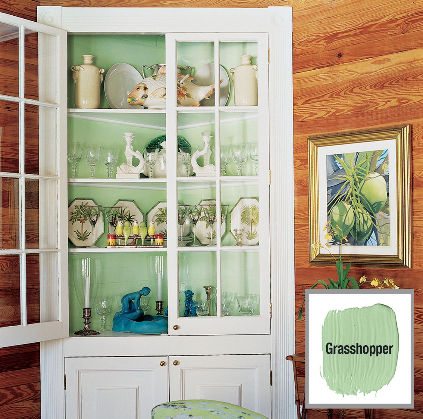
Spotlight a Collection
When painted in a contrasting color, a corner cupboard or built-in shelving unit becomes a stunning showcase for your favorite dishes or decorative objects. For example, painting the interior of a cupboard in a minty hue can beautifully highlight white dishes or glassware. This technique not only draws attention to your collection but also adds depth and interest to the overall room design.
Try echoing the built-in’s interior color in other elements of the room, like dining chairs or accent pieces. A crisp white exterior paint on the built-in, combined with natural pine wall paneling, can provide a fresh backdrop that lets your colorful display shine.
Paint: Pratt & Lambert
Enhance an Open Feeling
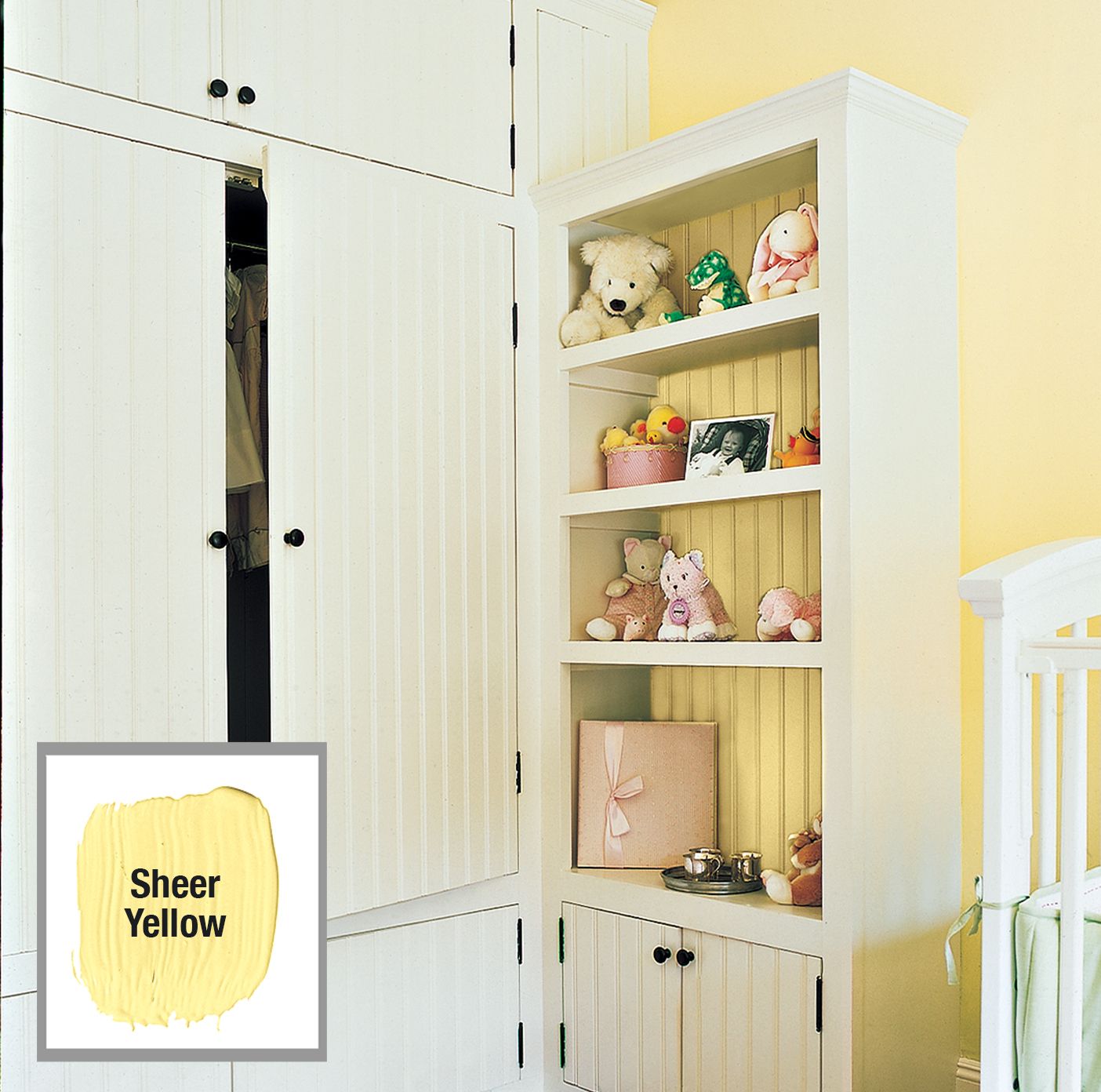
Color can also enhance the sense of openness in a room, particularly when applied to built-in elements. For instance, painting the back panel of a shelving unit the same color as the surrounding walls can create a seamless, expansive look. This is especially effective in smaller spaces or rooms with multiple built-in features.
A sunny yellow applied to both the walls and the interior of a shelving unit can make the built-in appear lighter and more integrated with the room. This balances the visual weight of larger pieces, such as an attached wardrobe, for an airy and open feel throughout the space.
Paint: Dutch Boy
Punch Up Trim and Panels
Applying a single color to all woodwork in a room or throughout a house can create a consistent, grounded look that ties different spaces together. This approach works particularly well when you want to highlight architectural details or create a bold, contemporary feel.
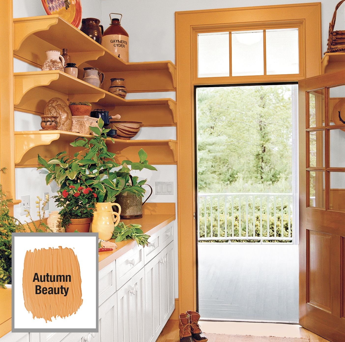
Reverse the Conventional Scheme
For a unique twist on traditional color schemes, try reversing the typical arrangement of white trim against colored walls. Painting trim, crown molding, open shelving, and door casings in a bold, glossy color—like a rich pumpkin hue—can create a striking frame for white walls and cabinetry. This reversal draws attention to the room’s architectural features while allowing other elements to recede visually, creating an interesting play of foreground and background in your design.
Link Spaces With Trim Paint
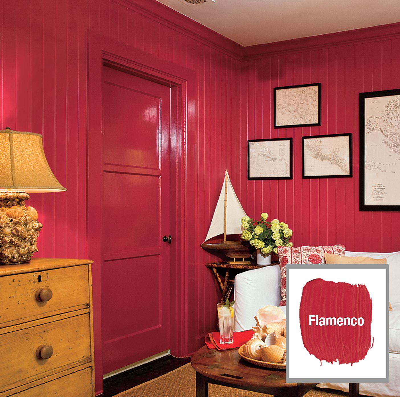
Using the same paint color for wall paneling, doors, and moldings throughout connected spaces can create a strong visual link between rooms. Zimmer suggests this technique to add drama to your home’s interior design.
The choice of color can significantly impact the perceived size and atmosphere of a space. A deep, rich fiery tomato red can make a large room feel more intimate and cozy, perfect for creating a snug den or study. Conversely, lighter colors can help smaller spaces feel more open and airy.
You can also use this technique to highlight special architectural features, such as archways, ceiling beams, or built-in shelves.
Paint: Ace Paint
Wrap a Room in Color
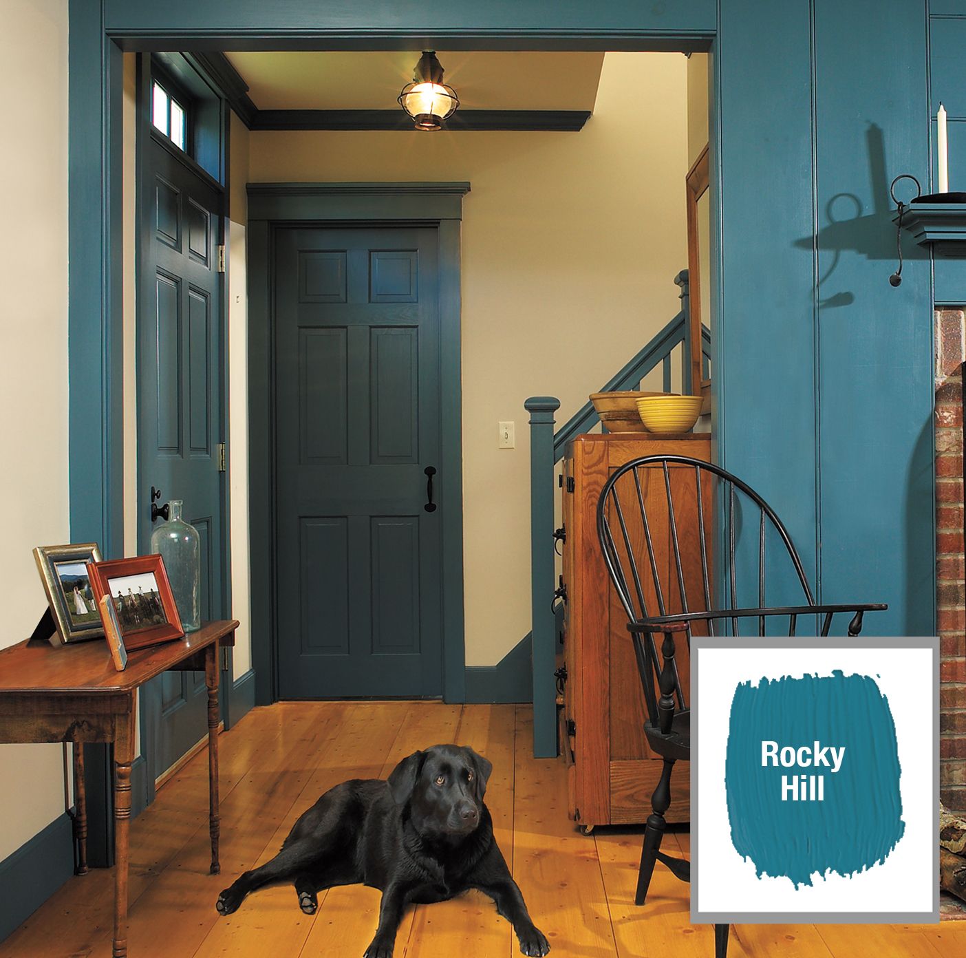
Extending a single color across multiple surfaces and rooms can create a seamless, enveloping effect that unifies your living spaces. For example, painting both the living room and the adjacent foyer’s woodwork in the same shade of blue creates a smooth transition between the two areas.
This technique has the added benefit of highlighting architectural details. A saturated color applied to trim and moldings can emphasize shadow lines and intricate designs that might be less noticeable with traditional white paint. The result is a rich, layered look that adds depth and character to your home’s interior.
Paint: California Paints