We may be compensated if you purchase through links on our website. Our team is committed to delivering honest, objective, and independent reviews on home products and services.
Choosing the right paint colors for a historic home can be daunting, especially for a Folk Victorian. These charming houses, popular in the late 19th century, are known for their ornate details and potential for colorful expression. In this article, we’ll explore how a thoughtful paint scheme can breathe new life into a Folk Victorian, transforming it from a blank canvas into a neighborhood gem.
Before Painting a Folk Victorian
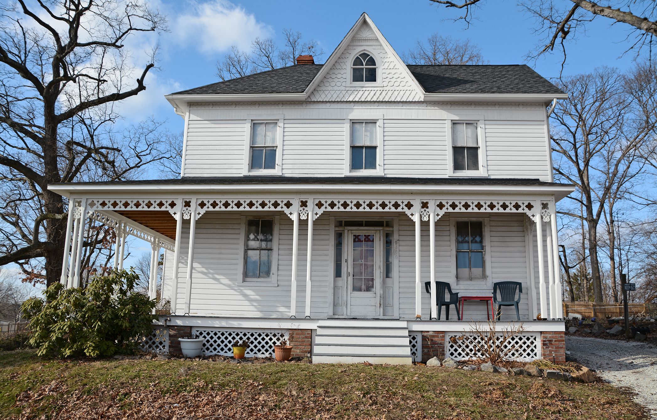
“We are having the hardest time choosing paint colors!” says Christi Noel of the 1896 home near Baltimore that she shares with her husband. This sentiment is common among homeowners of historic properties, where the pressure to honor the home’s heritage while expressing personal style can be overwhelming. In the case of the Noels’ home, the indecision led to years of the house standing primed but unpainted, a testament to the challenge of color selection.
To break this color paralysis, we sought the expertise of James Martin, a Denver-based architectural color consultant. Martin’s approach focuses on creating harmonious color schemes that respect the home’s historical context while meeting modern aesthetic preferences.
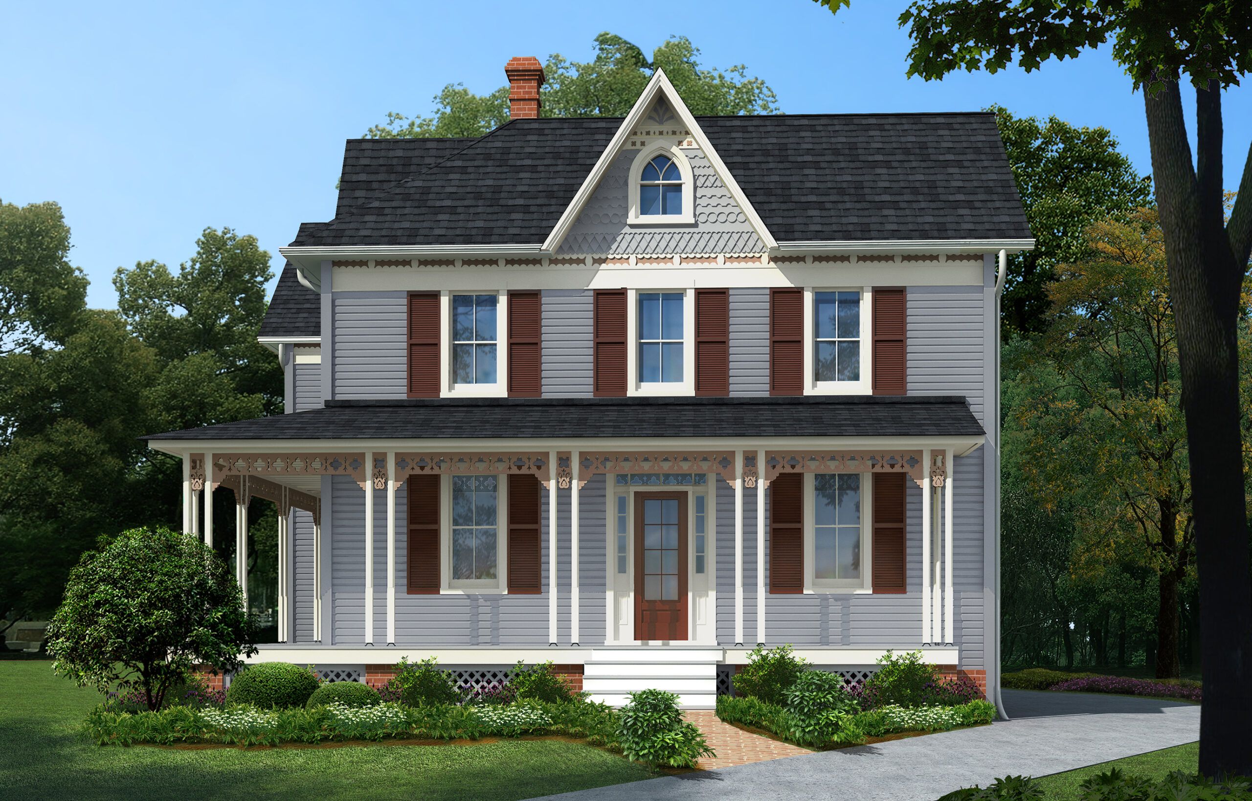
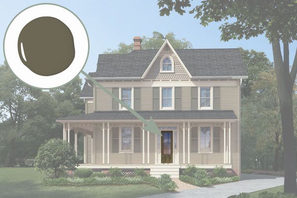
After Painting a Folk Victorian
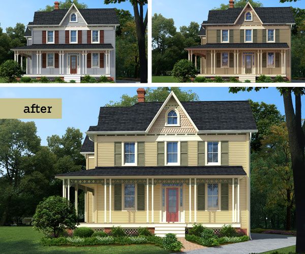
Martin’s color strategy for the Noels’ Folk Victorian is rooted in the Victorian principle of environmental harmony. With the house situated on two leafy acres, he selected three earthy palettes that complement the natural surroundings. “We deepened the body color and lightened the trim so that the porch would step out,” Martin explains, highlighting the importance of creating depth and dimension through color contrast.
In the featured scheme, a subtle taupe accentuates the shingles on the gable end, demonstrating Martin’s philosophy: “You don’t want bright earrings to ruin your whole outfit. It’s the same with balancing the look of a house.” This approach ensures that accent colors enhance rather than overpower the home’s architectural features.
Christi’s reaction to the proposed color schemes was enthusiastic: “I love how the accent colors really draw your eye to the details—I feel like we finally have ideas we can act on.” This response underscores the transformative power of well-chosen colors in revitalizing a historic home.
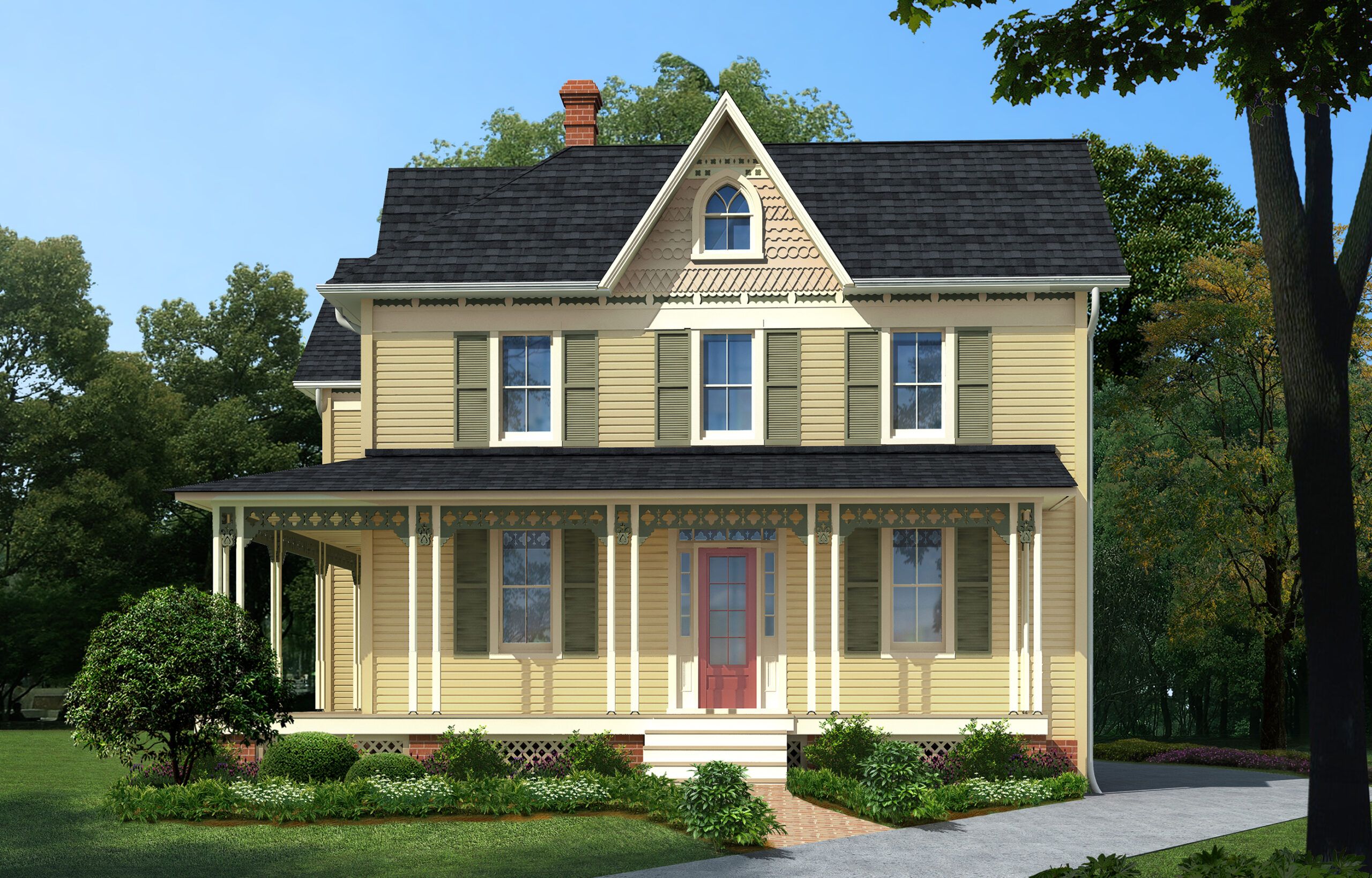
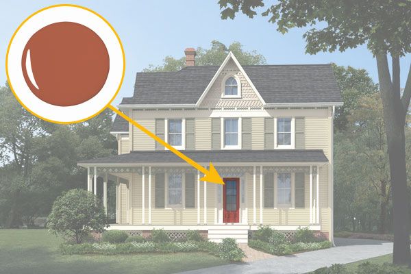
The original shutters, discovered in the barn and reinstalled, add a punchy color accent that ties the whole look together. This detail showcases how incorporating existing elements can contribute to a cohesive and authentic exterior design.
Shown: The original shutters, found in the barn and reinstalled, add a punchy color accent.
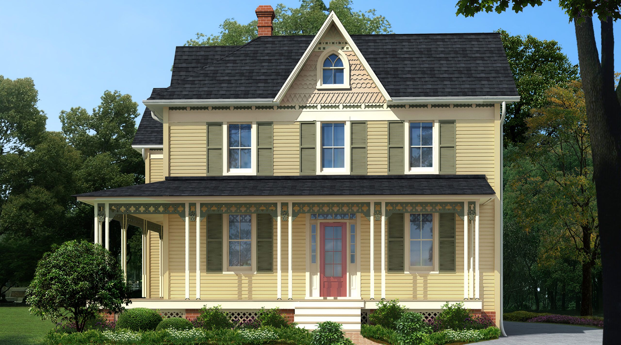
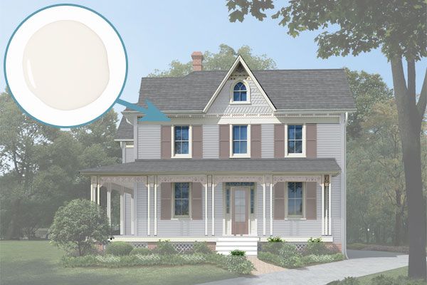
Palette 1: Calm Yellow
The first palette Martin proposes centers around a calm yellow hue. “Colors can get out of hand—too bright, too strong—especially on a house of this size,” Martin cautions. “This body color is convivial and welcoming.” The choice of a subdued yellow creates a cheerful yet sophisticated exterior that doesn’t overwhelm the senses.
To complement the brick-red door, Martin selected olive green for the shutters, gingerbread porch trim, and cornice work. This combination of warm and cool tones creates a balanced and inviting facade that respects the home’s Victorian heritage while feeling fresh and current.
Calm Yellow, Body Color
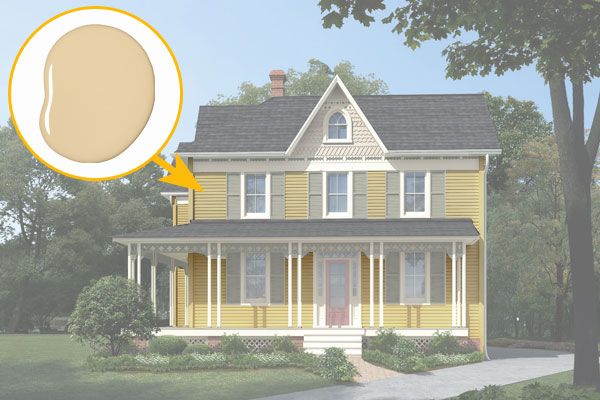
Sherwin-Williams’s Ivoire
Calm Yellow, Trim Color
Calm Yellow, Body Accent Color
Calm Yellow, Shutters Color
Calm Yellow, Front Door Color
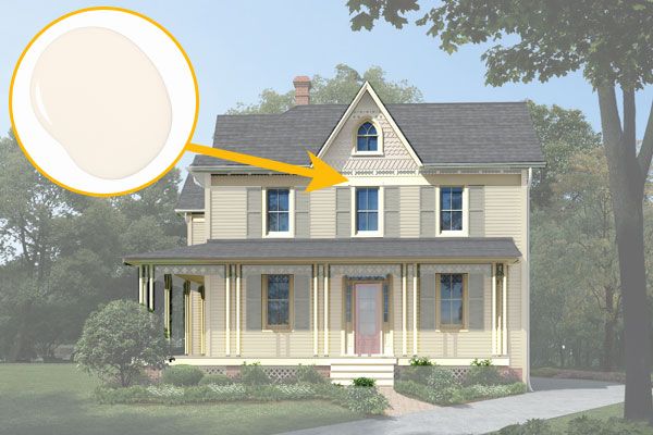
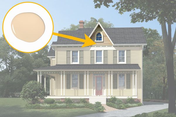
Palette 2: Cool Gray-Blue
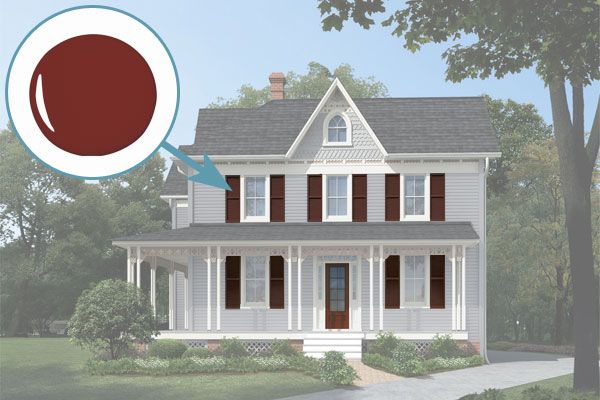
The second palette Martin presents is a sophisticated cool gray-blue scheme. This color combination offers a more subdued and elegant approach to the Folk Victorian’s exterior. “It was a Victorian rule of thumb for front doors and shutters to be the same color,” Martin notes, applying this historical insight to create a cohesive look.
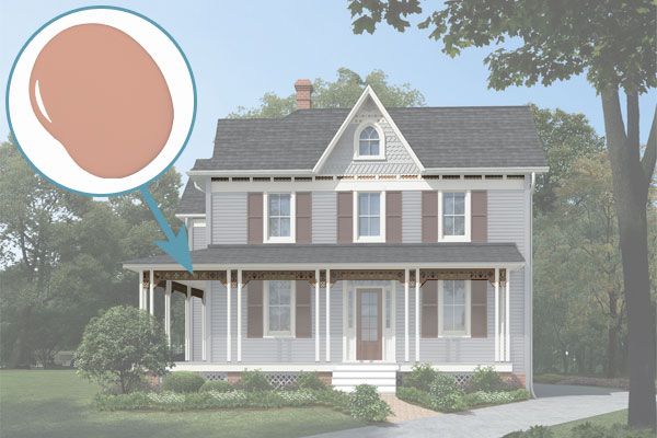
In this palette, the brownish-red front door and shutters provide a striking contrast to the gray-blue body of the house. Paler tones, including a soft blue in the gable end and beige accents, highlight architectural details and unify the overall color scheme. This palette demonstrates how a cooler color scheme can still create warmth and visual interest on a Victorian home.
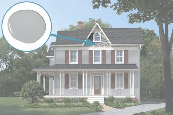
Cool Gray-Blue, Body Color
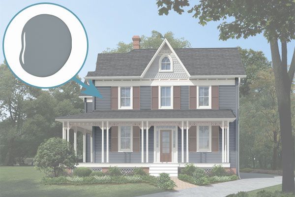
Sherwin-Williams’s Steely Gray
Cool Gray-Blue, Trim Color
Cool Gray-Blue, Body Accent Color
Cool Gray-Blue, Secondary Accent Color
Cool Gray-Blue, Shutters and Front Door Color
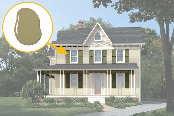
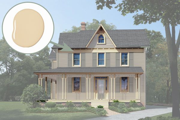
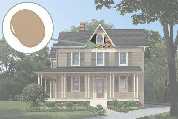
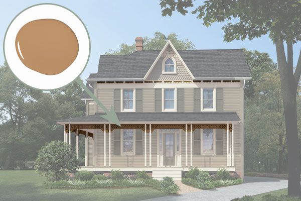
Palette 3: Warm Khaki
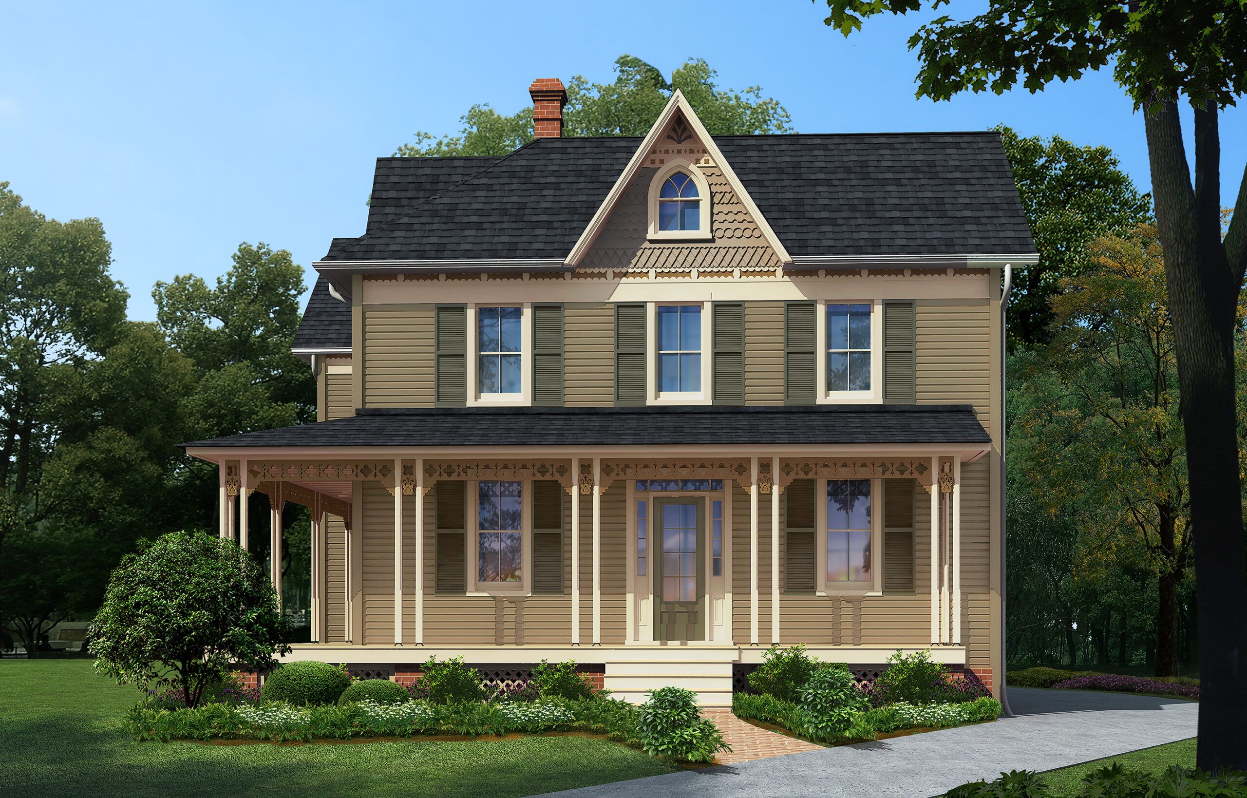
The third palette Martin proposes is a warm khaki scheme that draws inspiration from the surrounding farmland. “This relatively simple house doesn’t lend itself to an elaborate painted-lady color scheme,” Martin explains. “Subdued colors keep the final product from being too over-the-top.”
The body color is olive green, echoing the natural environment, while camel, sage, and tan accents add visual interest without overwhelming the home’s architecture. This palette demonstrates how earthy tones can create a sophisticated and timeless look for a Folk Victorian, proving that historic homes don’t always need bold colors to make a statement.
Warm Khaki, Body Color
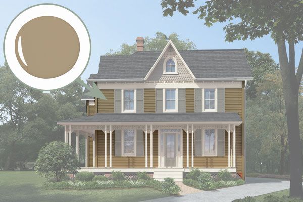
Benjamin Moore’s Northampton Putty
Warm Khaki, Trim Color
Warm Khaki, Body Accent Color
Warm Khaki, Secondary Trim Color
Warm Khaki, Shutters and Front Door Color
Our Conclusion
Choosing the right paint colors for a Folk Victorian home is a delicate balance of honoring history and expressing personal style. The three palettes presented—calm yellow, cool gray-blue, and warm khaki—offer diverse options that can enhance the architectural beauty of these charming homes. By considering the home’s surroundings and architectural details, you can create a cohesive and inviting exterior that stands the test of time. Additionally, incorporating accents that harmonize with the landscape and preserve historical elements ensures an exterior that is both timeless and distinctly personal.