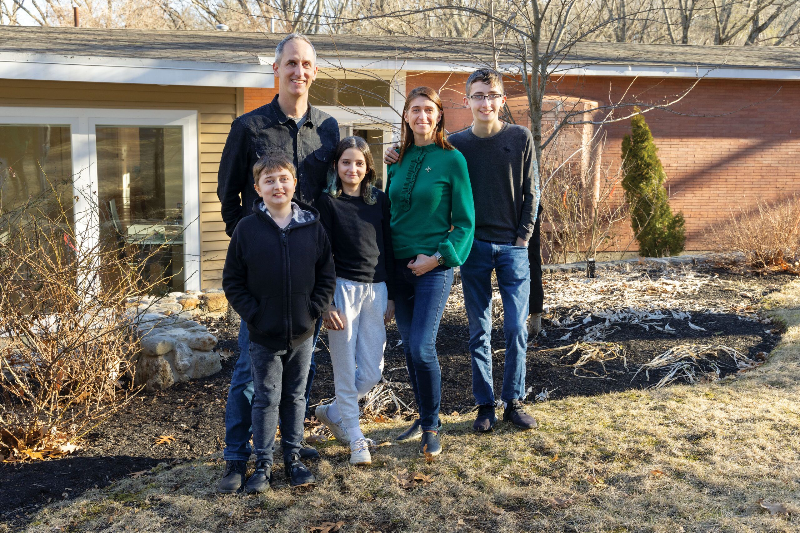
For most families, finding a new place to live is a whirlwind of decisions in which size, location, cost, and gut feelings guide the choice. But for Michelle Werner, Billy Lester, and their three children—Wix, Caffrey, and Marlowe—there was an additional factor to consider. Thirteen-year-old Caffrey has Duchenne muscular dystrophy, a progressive disease affecting his mobility; it’s a given that he will be using a wheelchair at some point in the future. So when the family moved to the Boston area last year for Michelle’s job, their house hunting involved considerations such as first-floor bedrooms, large open-plan gathering areas, and space for an elevator. “We needed a house that would help set our family up for success,” says Billy.
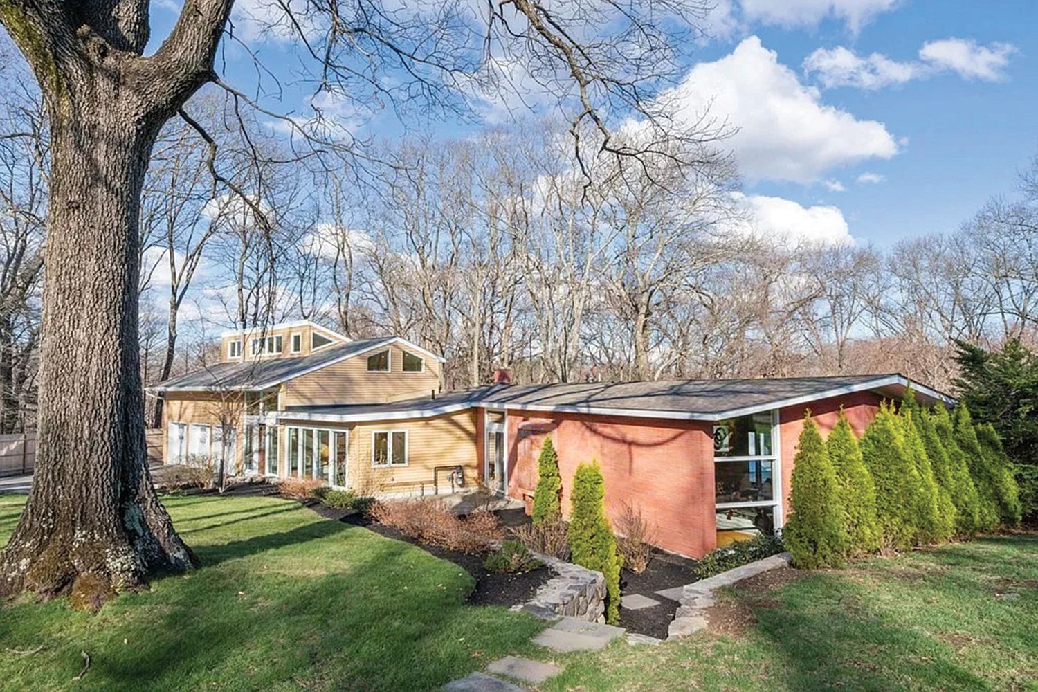
Their search led to a mid-century modern house in Lexington, Massachusetts, that hardly fit the bill but had potential. “It had lots of character, and we liked all the living spaces on one level,” says Michelle. But the primary bedroom was on top of the garage, far from the main-level bedroom where Caffrey would sleep; the galley kitchen was too cramped for sharing meal-prep duties; and most interior doorways were a standard 32 inches wide, while wheelchair use requires at least 36 inches. Plus, from an aesthetic point of view, the house had become a hodgepodge as it was expanded over time.
Billy and Michelle consulted architect Sandra Jahnes and TOH home builder Charlie Silva to see how they could reconfigure the house to meet the family’s needs, and enhance its mid-century modern style. They had heard that This Old House was looking for projects to document for its 45th season and were glad to raise their hands. “We knew This Old House would do a great job, and the show’s schedule would help keep us on track,”says Billy.


The existing house, designed by architect Bernard Lange and built in 1960, had an L-shaped main level that held four bedrooms, three baths, the kitchen, and dining and living areas defined by an interior brick wall; a large rear patio nestled in the footprint’s L. Over the years, more living space was added with the garage and foyer additions, but at a cost: “The additions did a disservice to the original mid-century modern design with their jarring materials and look—vinyl clapboards and mismatched roof styles,” says Jahnes. Her plan for an integrated ramp and front entry capped with an angled roof will shift focus from the garage and complement the original house.
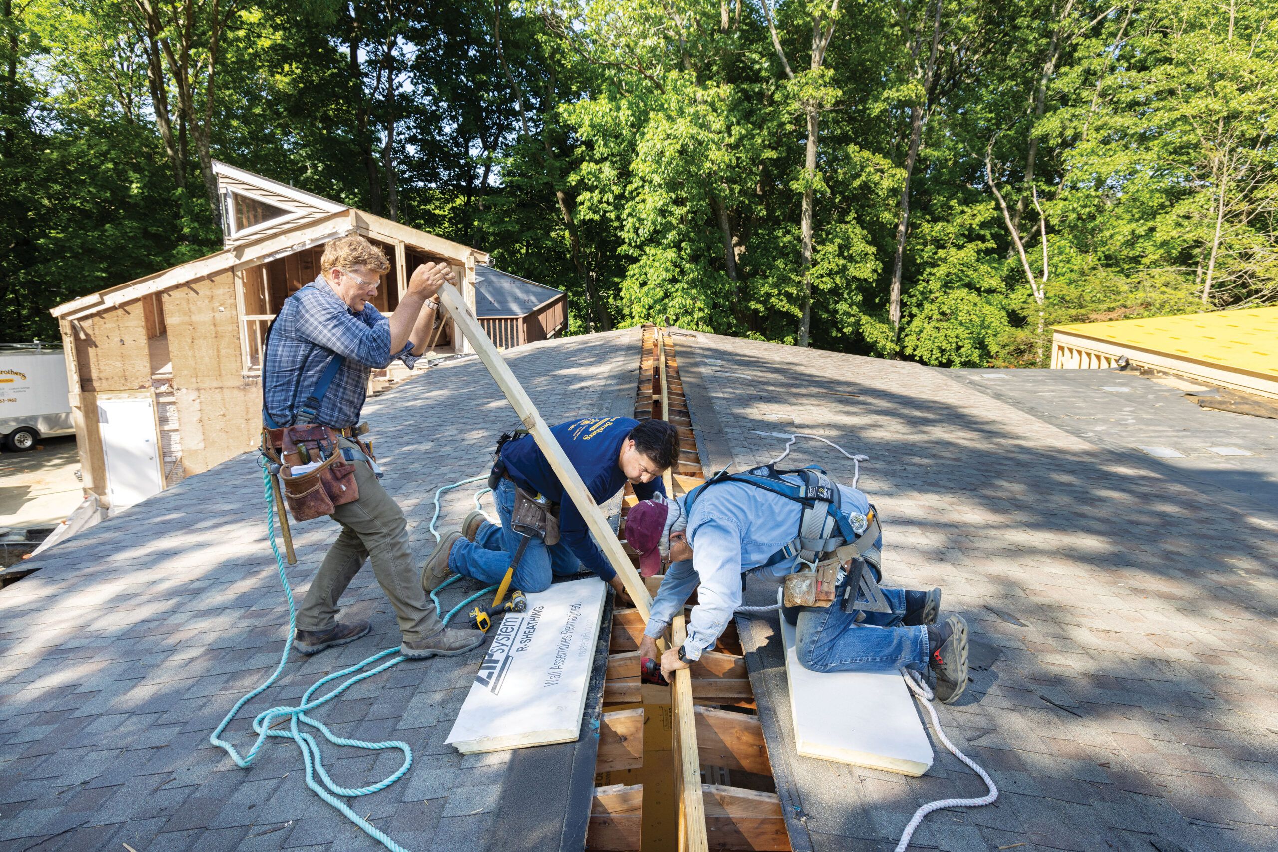
Inside, to provide gathering spaces with easy navigation, Jahnes designed open-plan living and family room areas built around an expanded kitchen and occupying most of the original foot print. For Charlie, the new interior meant that existing partition walls, except the original brick one, had to come down and a new ridge beam had to go up. Three LVL (laminated veneer lumber) beams, each 45 feet long and 460 pounds, were craned into place to form the ridge that spans the area.
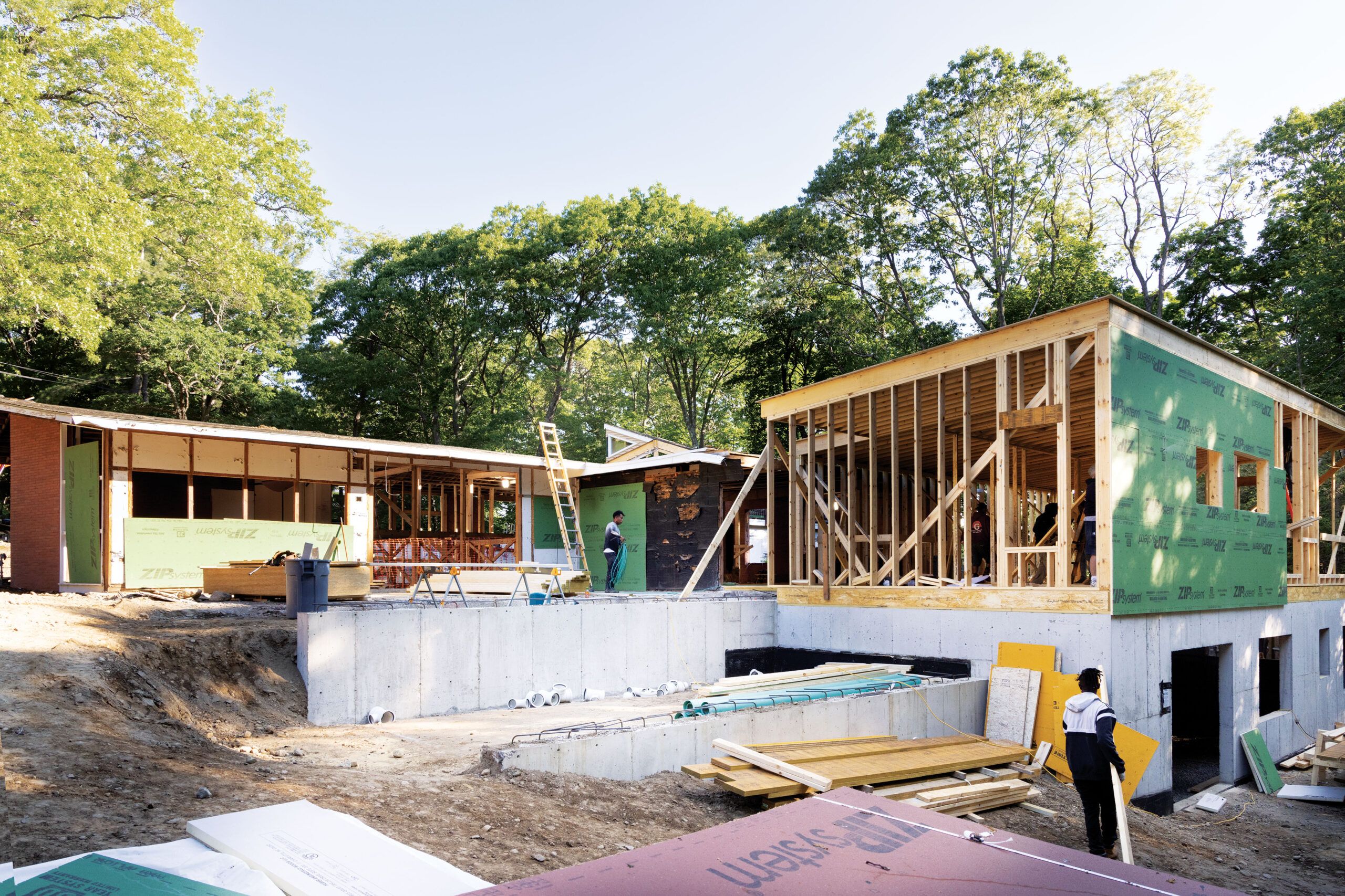
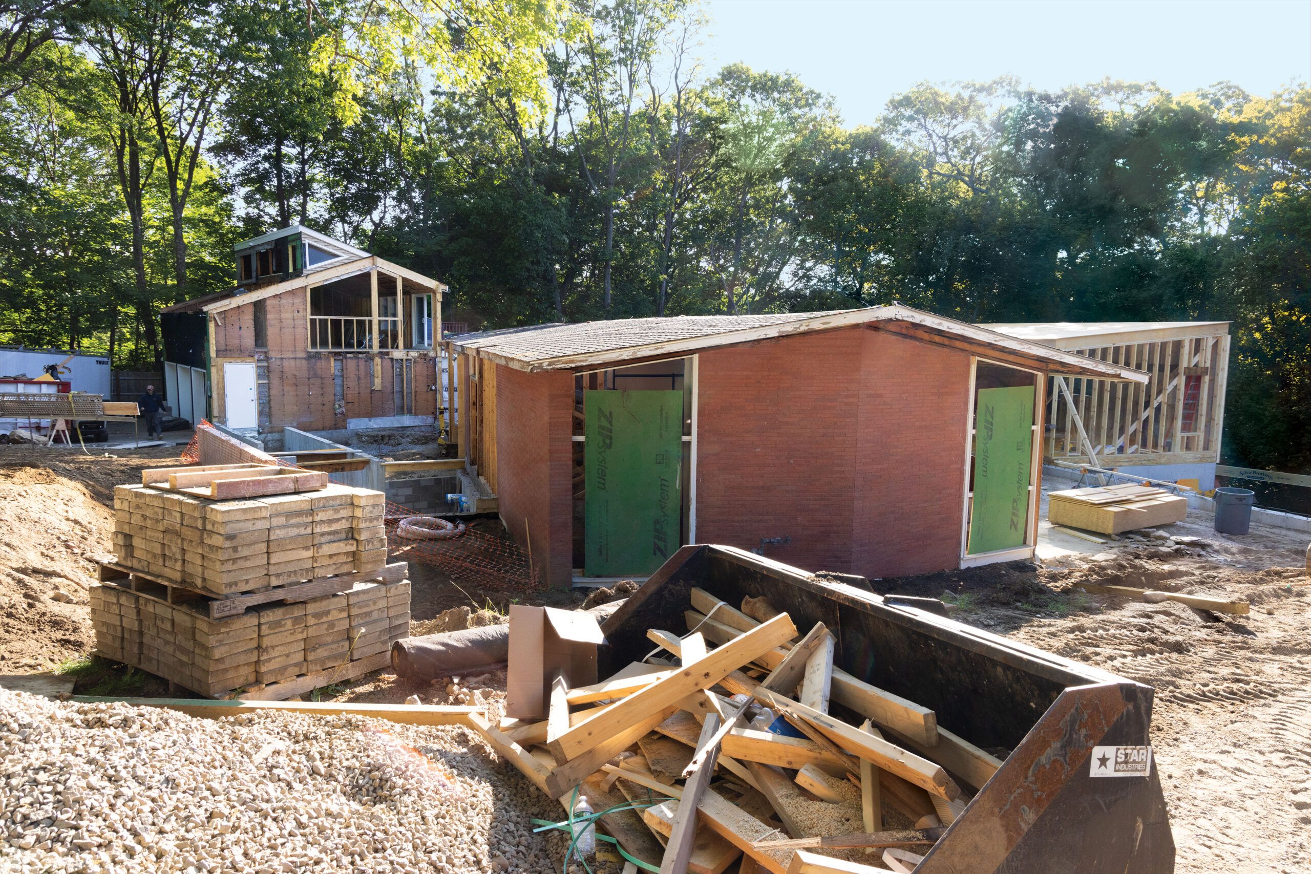
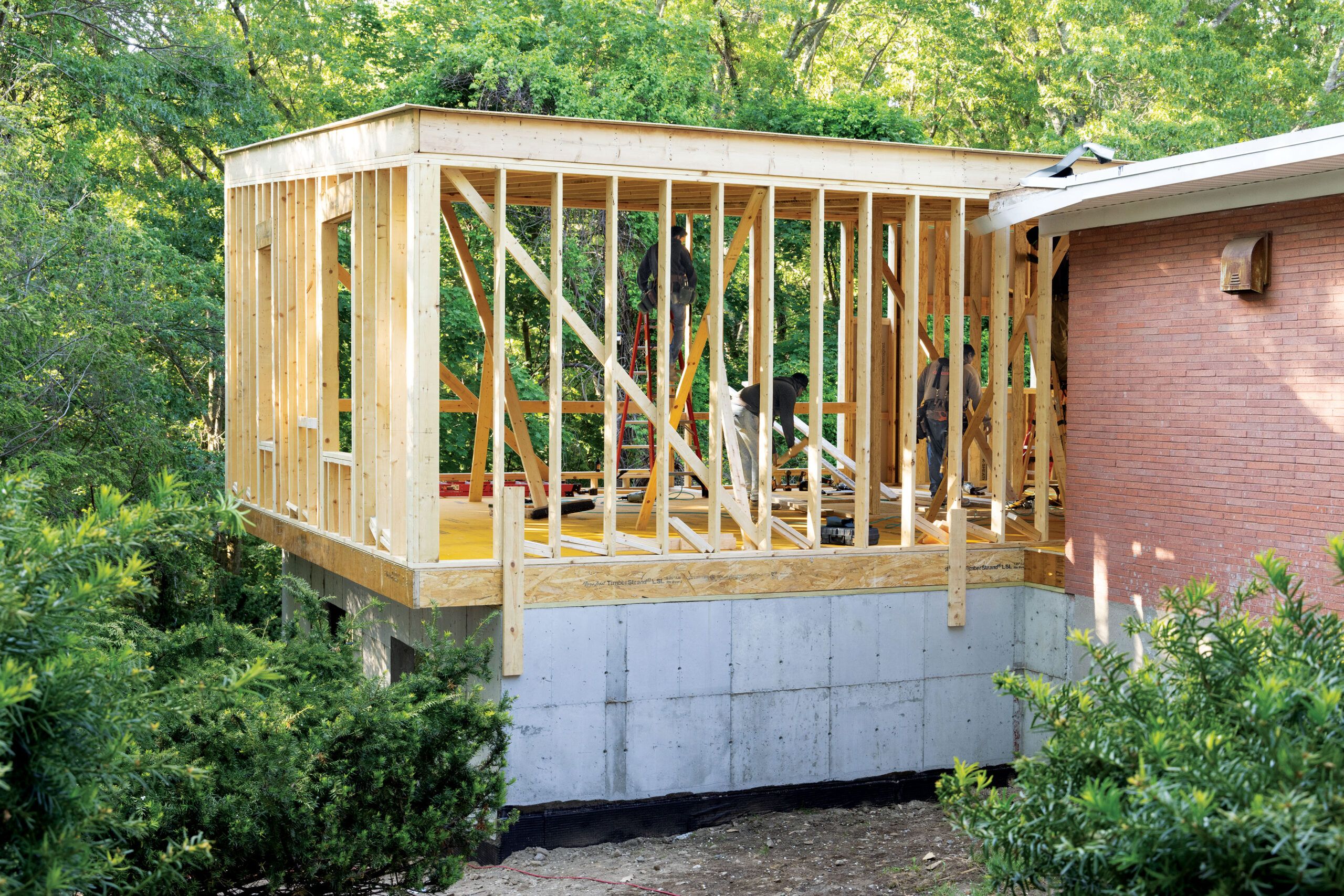
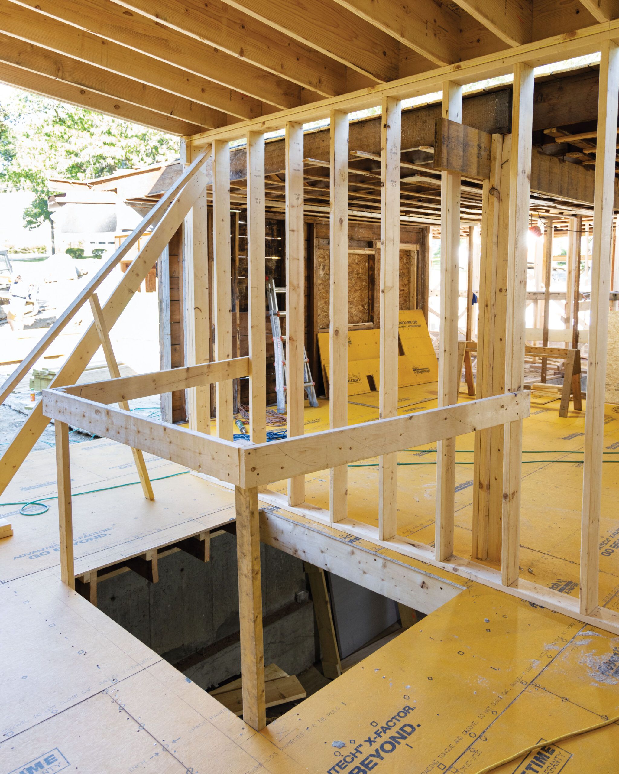


The family wanted main-level bedroom suites with Michelle and Billy’s adjacent to Caffrey’s; they also wanted Marlowe’s suite nearby as she is particularly close to Caffrey. Jahnes designed Marlowe’s room within the original main-level footprint; room for the primary and Caffrey’s suites required a 26-by-50-foot addition at the rear of the house. Oldest son Wix opted for a bedroom in the lower level of the addition, next to the rec room. The new main-floor layout also includes a dining area added in the front of the house, off the kitchen, and a shaftway for an elevator outside Caffrey’s room to take him to the rooms below. “We want Caffrey to have access to the entirety of the house, not just a section,” says Michelle. “That is paramount.”
Accessibility features such as 36-inch-wide doorways, level thresholds, wide halls, and curbless showers are integral to the plan in the areas Caffrey will use every day, and the team is prepping for them while framing. “Now is the time to add blocking for things like a lift system in his bedroom, even though the ceiling track isn’t needed yet,” says TOH general contractor Tom Silva.
Another of the project’s goals is energy efficiency and meeting the state’s stringent Home Energy Rating System (HERS) requirement. To satisfy it, Charlie beefed up the insulation: He framed the addition using 2-by-6 bays filled with closed-cell foam and built a new roofing system with 2-by-8 framing with closed-cell foam and two more foam layers. He replaced the existing R-0-rated concrete slab floors in the basement and main levels with a layered foam-slab-foam-wood floor system. “The extra insulation adds to the costs, but it creates a much more energy-efficient house,” says Charlie.
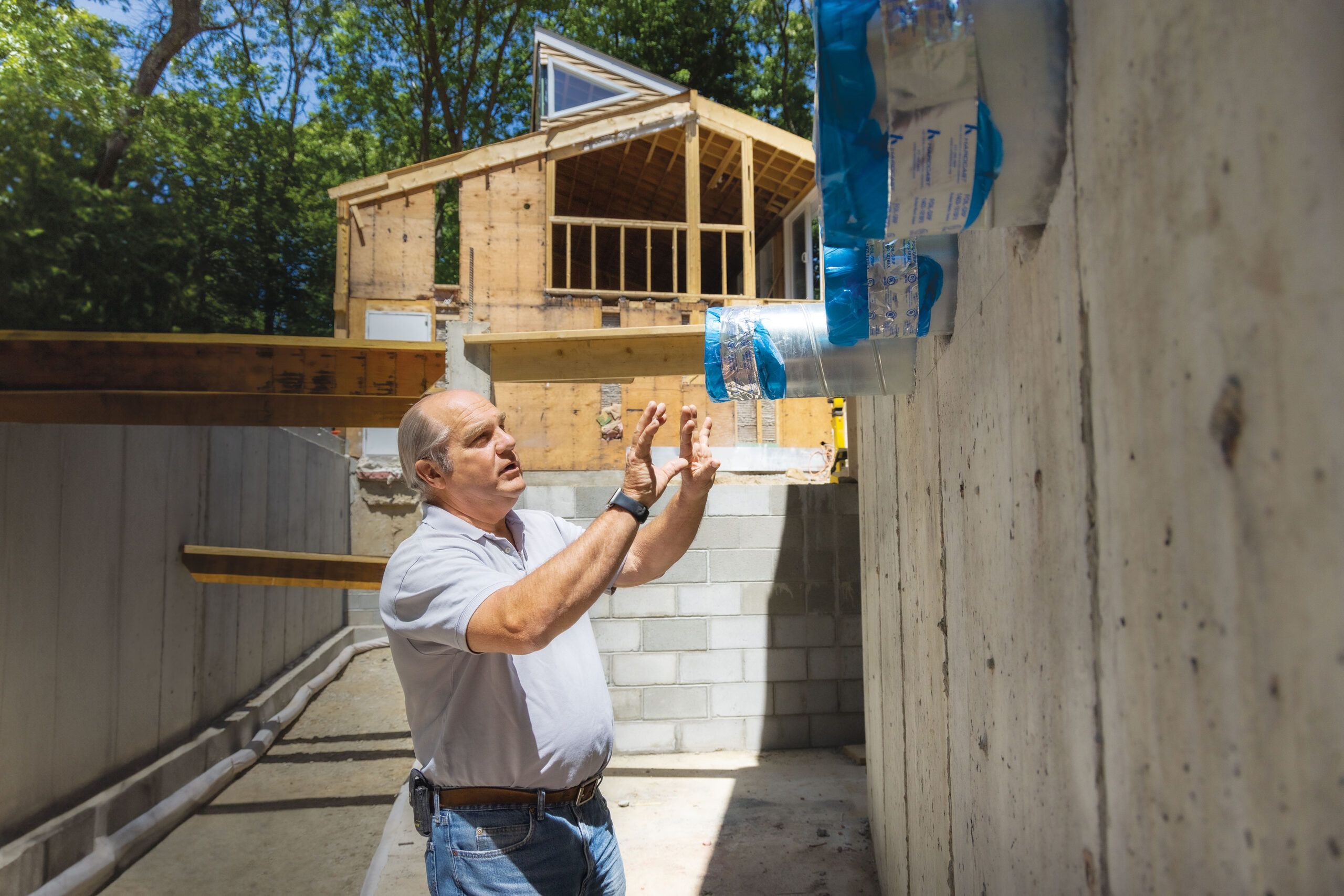
The homeowners also chose an ultra-efficient geothermal system for their heating and cooling, an installation that requires four 500-foot-deep wells to be dug on the property. “With geothermal, it’s all about moving heat rather than making heat,”says TOH plumbing and heating expert Richard Trethewey. Heat extracted from deep underground will be transferred via a water-to-water system that will feed radiant in-floor heating, domestic water heaters, and forced-air cooling. In preparation, Charlie created mechanicals spaces in the front dining-area addition’s foundation to hold the equipment, dug a tunnel from this new front basement to the existing rear basement, and dug trenches throughout the main level to bury the air-distribution ductwork.
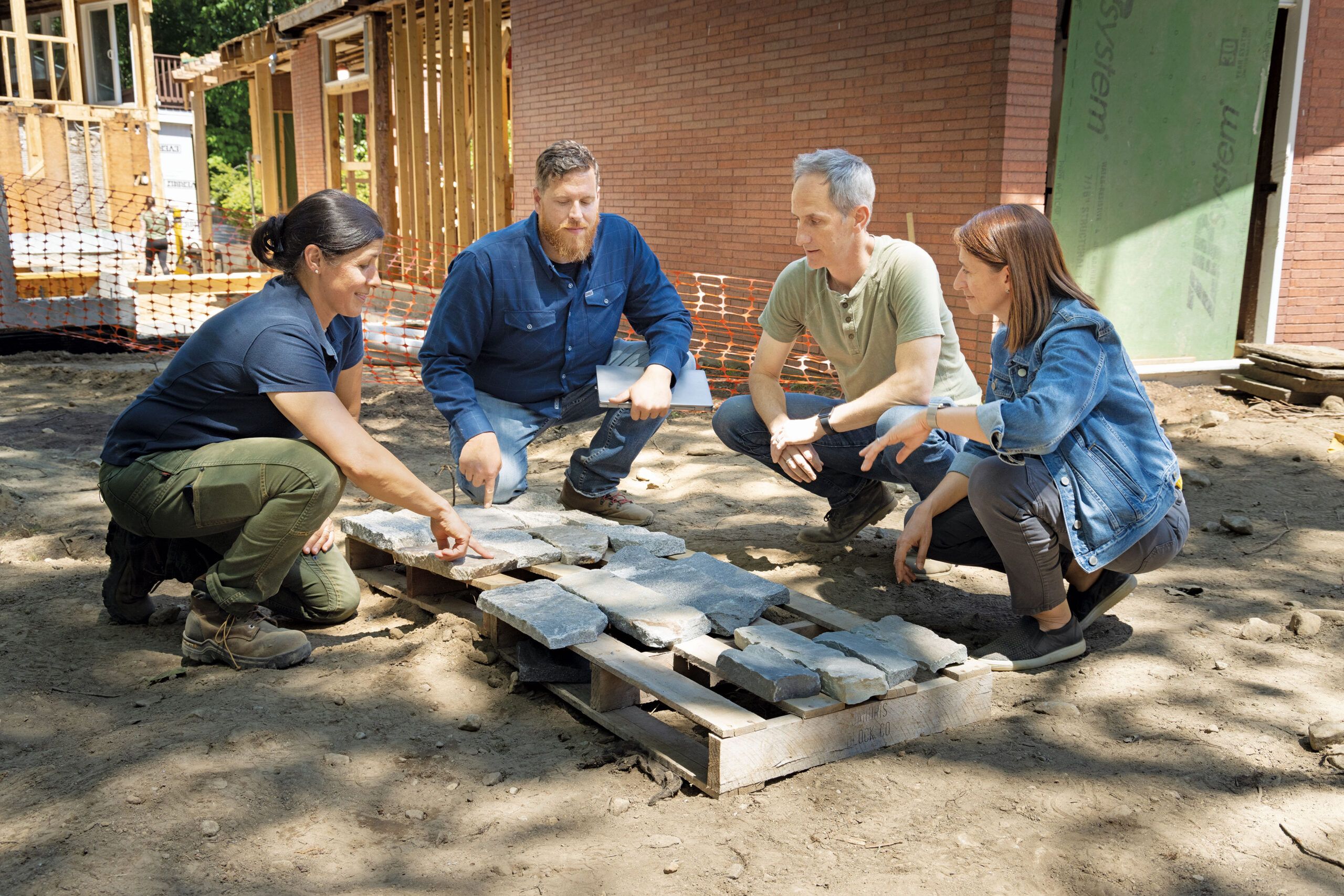
Outside, the main family space will be the back patio. To create a level surface from indoors to out, the patio needs to be raised; TOH landscape contractor Jenn Nawada helped Billy and Michelle choose materials for the area, which will include a fire pit, a dining table, and a hydrotherapy spa recommended for Caffrey. “This patio will give the family so much enjoyment,” Jenn says.
As work progresses at a fast clip, the family is pitching in: Everyone helped Charlie with demo, and Billy is researching everything from door handles to appliances with accessible design. Says Billy: “The overarching goal here is independence—creating a house that extends Caffrey’s independence as long as possible.”
