Selecting the perfect colors for your home’s interior can create an inviting atmosphere and transform your living space. The right colors can enhance architectural features, define areas in open floor plans, and even affect your mood. Whether you’re looking to refresh a single room or coordinate colors throughout your entire home, here’s a step-by-step guide to finding the best colors for your home.
Understanding Color Psychology in Interior Design
Color profoundly impacts our emotions and behavior, making it a powerful tool in interior design. By understanding the psychological effects of different hues, you can create spaces that evoke specific moods and enhance the functionality of each room.
The Emotional Impact of Different Colors
Different colors can elicit various emotional responses. Warm colors such as red, orange, and yellow tend to energize and stimulate, while we often perceive cool colors such as blue, green, and purple as calming and restful. Maxwell Ryan, founder of Apartment Therapy, suggests using warm colors in social rooms like dining rooms and kitchens while reserving cooler hues for private spaces such as bedrooms and home offices.
Using Color To Create Atmosphere
Strategic use of color can help you set the desired atmosphere in any room. For example, yellow can stimulate the brain, making it a good choice for study areas—but it’s best avoided in bedrooms where relaxation is the goal. Instead, explore calming colors to promote better sleep. Remember that personal preferences play a significant role. What feels welcoming to one person may be off-putting to another.
Creating a Cohesive Color Scheme
A well-planned color scheme helps your home feel unified and thoughtfully designed. By following some basic principles, you can create a palette that flows seamlessly from room to room.
The 60-30-10 Rule for Color Distribution
The 60-30-10 rule is a classic interior design principle that helps create balanced and appealing spaces. According to this rule, 60% of a room should be a dominant color, 30% a secondary color, and 10% an accent color. This distribution typically translates to walls being the dominant color, upholstery or flooring as the secondary color, and accessories or artwork providing the accent color. We recommend following this guideline so your room’s color palette doesn’t feel over- or underwhelming.
Developing a Color Palette From Existing Decor
According to architectural color consultant Bonnie Krims, one effective method for choosing a color scheme is to start with an existing object in your home.
“Take a pillow from the family room sofa, your favorite tie or scarf, or a painting—anything that conveys comfort or has an emotional connection for you—and bring it to the paint store,” says Krims. “Find three sample strips with those colors, and you instantly have 15–18 colors you can use since each sample strip typically contains six paint colors.”
Selecting Paint Colors for Different Room Types
Each room in your home serves a unique purpose, and the colors you choose should reflect and enhance that function. Here’s how we recommend approaching color selection for various room types.
Selecting Colors for Bedrooms
Bedrooms should promote relaxation and restfulness. Soft, cool colors such as pale blues, lavenders, and greens can create a soothing environment conducive to sleep. If you prefer warmer tones, consider muted versions of colors such as terracotta or pale yellow. Remember that darker colors make a room feel cozier, which you might value in a large bedroom.
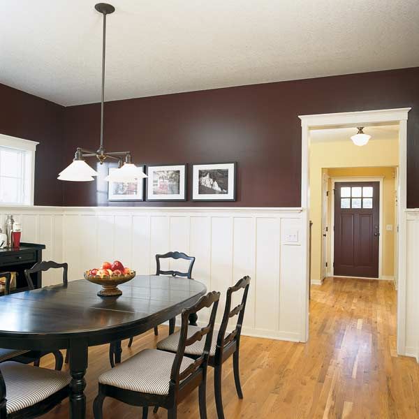
Selecting Colors for Kitchens and Dining Rooms
Kitchens and dining rooms benefit from colors that stimulate appetite and conversation. Warm colors such as reds, oranges, and yellows can be effective in these spaces. But be cautious with intense shades that might be overwhelming in large doses. Consider using these colors as accents against a neutral backdrop. Soft greens or blues can create a fresh, clean feel for a more serene kitchen.
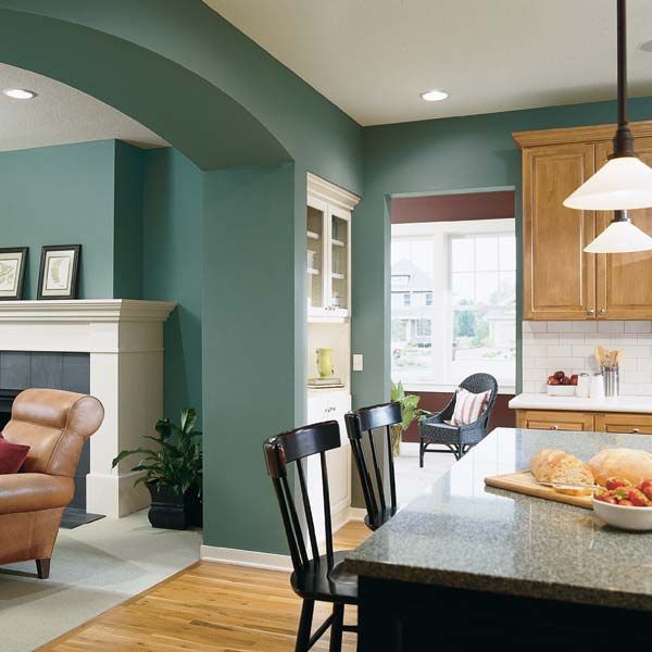
Selecting Colors for Living Rooms
Living rooms often serve as the heart of the home, where family and friends gather. To create a welcoming atmosphere, use earthy tones such as warm browns, soft greens, or muted oranges. If you want to make a statement, an accent wall in a bolder hue can add visual interest without overwhelming the space.
Considering Natural and Artificial Lighting’s Impact on Color
The amount and quality of light in a room significantly impact how colors appear. Natural light changes throughout the day, affecting color perception. Different types of artificial lighting can also alter color appearance.
We recommend using warmer whites or light colors to brighten rooms with limited natural light. In rooms with abundant natural light, you have more flexibility and can experiment with both light and dark shades.
The Role of White in Interior Color Schemes
White offers versatility and brightness in interior design. Understanding different types of white and how to use them effectively can elevate your color scheme.
Types of White Paint
White paints come in various shades, each with different undertones and characteristics. Pure, “clean” whites are formulated without tinted undertones. Designers looking to showcase artwork or furnishings often favor clean white paint. Most other whites fall into two categories:
- Cool whites: These contain green, blue, or gray undertones.
- Warm whites: These have yellow, rust, pink, or brownish undertones.
“Use warmer whites in rooms without a lot of natural light or to make larger spaces seem cozier,” advises Mary Rice, president of Ace Hardware’s paint division. On the other hand, cool whites can help open up a space.
When To Use White in Your Rooms
White is an excellent choice for ceilings, as it reflects light and makes a room feel more spacious. It’s also ideal for trim and moldings, creating a clean and classic look that complements various wall colors.
White walls can help create an illusion of more space and brightness in small rooms or spaces with limited natural light. But white paint can sometimes feel stark or cold if it’s not balanced with other elements in larger rooms or those with plenty of natural light.
Using Paint Color To Enhance Architectural Features
Color is a powerful tool for highlighting or downplaying architectural elements. You can use color strategically to draw attention to your home’s best features and create visual interest.
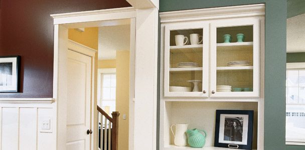
Highlighting Moldings and Trim Using Color
Use color to emphasize moldings, mantels, built-in bookcases, and other decorative elements. Sheri Thompson, former director of color marketing and design for Sherwin-Williams, suggests painting molding or doorways one step lighter or darker than the primary wall color. “It’s a subtle shift in color, but it really brings your eye to the detail,” Thompson says.
For a more dramatic effect, you can paint molding, trim, and architectural features in a contrasting color to the walls. White trim against colored walls is a classic choice that makes both the walls and trim stand out.
Creating Accent Walls
An accent wall can add a focal point to a room, especially in spaces without architectural interest. Choose one wall to paint in a bolder or contrasting color to create an accent wall. This technique can be particularly effective in bedrooms, living rooms, or home offices.
When selecting a color for an accent wall, consider the room’s purpose and the mood you want to create. A vibrant color energizes a space, while a deeper hue adds sophistication and depth.
Paint Color Strategies for Open Floor Plans
Open floor plans present unique color selection challenges. You want to create a cohesive look while still defining functional areas within the space.
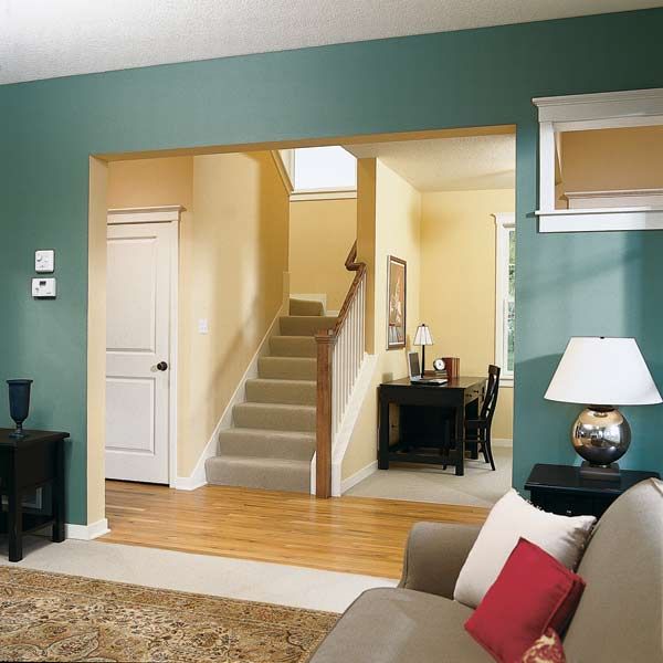
Zoning With Paint Color
You can use color to “zone” different areas in an open floor plan. For example, you might use one color for the kitchen area and a complementary color for the adjoining living space. This technique helps to separate the spaces while maintaining a harmonious look overall.
Maintaining Flow Between Spaces
Use colors with similar undertones throughout your space to create a sense of flow in an open floor plan. This doesn’t mean you have to stick to a single color or even a single color palette, but choosing colors that share warm or cool undertones helps create a cohesive look.
Tami Ridgeway, a color stylist for Valspar, recommends using muted, dustier values when selecting colors for open spaces. These softer hues are more likely to flow smoothly from one area to another. Another popular strategy is using a consistent trim color. This can provide a unifying element that ties different color zones together.
Making Small Spaces Feel Larger With Color
We know that color choice can significantly impact the perception of space in a room. By understanding how different colors affect spatial perception, you can make small rooms feel more open.
Light Colors for Spaciousness
Light colors make a space feel larger. Crisp whites, soft pastels, and light neutrals can all help to expand a small room visually. These colors reflect more light, creating an airy, open feeling. You may also consider painting the ceiling a lighter shade than the walls to give the illusion of higher ceilings and more vertical space.
Dark Colors for Coziness
While designers traditionally recommend light colors for small spaces, dark colors can create a cozy, intimate atmosphere. In spaces such as powder rooms, studies, or small bedrooms where you want to develop a sense of warmth and enclosure, deeper hues such as hunter green, navy blue, or rich burgundy can be excellent choices.
When using dark colors in small spaces, we recommend balancing them with lighter furnishings and plenty of good lighting to prevent the room from feeling too cramped or gloomy.
Exploring Bold Paint Color Options
If you’re willing to make a statement with color, several bold techniques can add drama and personality to your spaces.
Two-Tone Wall Techniques
Two-tone walls can add visual interest and create the illusion of architectural features where none exist. One approach is to paint the bottom third of the wall in one color and the upper portion in another, creating a wainscoting effect. You can enhance this look by adding a piece of flat molding at the intersection of the two colors.
Another bold technique suggested by Doty Horn, founder of ColorVoyant and former director of color and design for Benjamin Moore, involves wrapping corners with color. Moving around the room clockwise, try painting one-third of one wall and two-thirds of the adjacent wall. Then, paint the last one-eighth of the second wall and three-quarters of its adjoining wall, covering that corner. This unconventional approach creates a striking effect and defines spaces within a room.
Colorful Ceilings as the Fifth Wall
While white ceilings are traditional, treating the ceiling as a fifth wall can dramatically transform a room. A colored ceiling can lower the perceived height of a tall room, fostering a more intimate feel or adding unexpected visual interest to any space.
Ken Charbonneau, a New York color marketing consultant, painted his 11-foot dining room ceiling Pompeiian Red to create a warm, cozy atmosphere. In rooms with standard 8- or 9-foot ceilings, a pale ceiling color such as Robin’s egg blue can create a soothing effect without making the space feel closed in.
Common Paint Color Mistakes To Avoid
When you’re choosing paint colors for your home, look for common pitfalls to achieve better results. Here are some mistakes to avoid:
Rushing the Decision Process
One of the biggest mistakes homeowners make is rushing the color selection process. It’s important to take your time and consider how colors will look in your specific space under different lighting conditions.
The best way to choose a color you’ll be happy with long-term is to paint a large swatch (at least 4-by-4-foot) on the wall and observe it for a day or two. This allows you to see the color in different lights throughout the day and how it interacts with your furnishings and flooring.
Not Testing Paint Colors in the Space
Another common mistake is relying solely on small paint chips or digital representations of colors. These can be misleading, as colors often look different depending on the surface and lighting conditions.
To avoid disappointment, use sample pots to paint pieces of poster board that you can move around the room. This approach gives you a much better idea of how the color will actually look in your space.
Forgetting About Primer
When changing the color of a wall, primer (white or tinted) is vital to getting the actual color you picked out. “Priming ensures there will be no interference from the previous wall color,” explains Michael Baillie, paint sales associate at The Home Depot.
Our Conclusion
Color selection isn’t an exact science, and there’s room for your creativity and personal expression. Don’t be afraid to experiment with different colors and techniques to find what works best for your home and lifestyle. With some planning and a willingness to test different options, you can create a color scheme that enhances your home’s beauty and fits your personality.