Terrifying Prints
If these walls could talk they’d say, “Help me!” Fortunately, This Old House reader remodelers came to the rescue, stripping the vertical eyesores from their kitchens, baths and other spaces. We invite you to have a laugh (or a groan) over this truly appalling paper trail. Warning: Some of these images may not be suitable for anyone with a lick of taste!
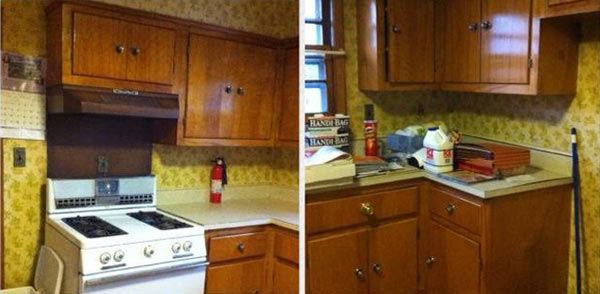
From Faux Vintner to Real Winner: Before

Who: Terri P.
Where: Rogers, AR
Yup, Terri admits she chose this lattice and grapes motif when it was all the rage 15 years ago, and even added the faux vines atop the cabinets.
From Faux Vintner to Real Winner: After

Who: Terri P.
Where: Rogers, AR
With time came wisdom and Terri went with a creamy, sandy semigloss paint to make the kitchen and dining area warmer and more inviting.
Who did the work: “A contractor did all the work.”
See all the images from this entry.
From Chamber of Horrors to Heavenly Sleep Space: Before
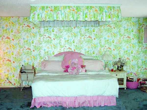
Who: Beth L.
Where: Tampa, FL
A jungle of ghastly green bedecked not only the bedroom walls but the speakers and ceiling-mounted ruffled canopy too.
From Chamber of Horrors to Heavenly Sleep Space: After
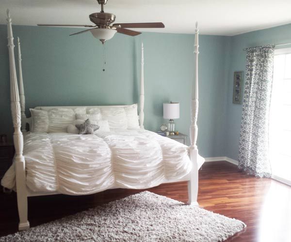
Who: Beth L.
Where: Tampa, FL
Beth awoke from this decor nightmare to reinvent the room with soothing blue walls far more conducive to peaceful slumber. The overall effect is feminine, not frightening.
Who did the work: “I did all the work myself.”
See all the images from this entry.
From Fruity to Refined: Before
Who: Connie A.
Where: Champlin, MN
Cherries and apples and pears…oh, my! This passé pattern no doubt gave Connie stomach cramps!
From Fruity to Refined: After

Who: Connie A.
Where: Champlin, MN
Connie scrapped the fruit-filled fiasco (along with the tile and everything else). Now, soothing blue paint complements sleek appliances and wood floors in her anything-but-kitschy kitchen.
Who did the work: “I did most of the work myself.”
See all the images from this entry.
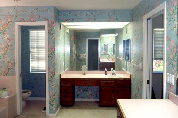
From Fowl Play to Chic Retreat: Before
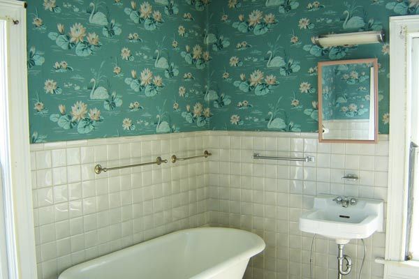
Who: Randy H.
Where: Geneseo, IL
Diehard fans of 1940s style may swoon, but this swan-and-lily-pad paper didn’t jibe with Randy’s vision for a sleek, contemporary bath.
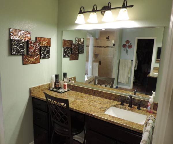
From Fowl Play to Chic Retreat: After

Who: Randy H.
Where: Geneseo, IL
The paper played its swan song in the room, as did the tile, replaced by chic, muted green paint floor to ceiling.
Who did the work: “I did most of the work myself.”
See all the images from this entry.
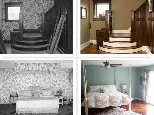
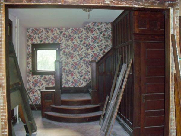
From Outlandish Eyesore to Golden Elegance: Before
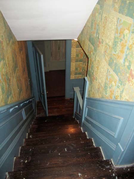
Who: Annie C.
Where: Akron, OH
This kind of wall covering represents a real safety hazard in a stairway—you’re likely to get dizzy and take a painful tumble. The mix of matte and metallic in a pattern Annie describes as “floral Oriental” was beyond bizarre.
From Outlandish Eyesore to Golden Elegance: After
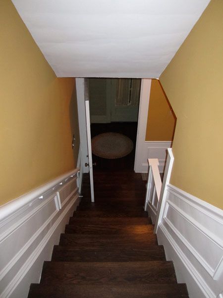
Who: Annie C.
Where: Akron, OH
Rather than strip, a shellac-based primer went on to soak through the paper and seal it to the walls, creating a new surface comparable to drywall. Light gold and white paint lend a classic airiness—no OSHA warning required.
Who did the work: “I did most of the work myself.”
See all the images from this entry.
From Leafy Lunacy to Polished Professionalism: Before
Who: Mark P.
Where: Portland, OR
Hard to imagine anyone having a sane thought in a home office plastered floor to ceiling with loony leafy paper.
From Leafy Lunacy to Polished Professionalism: After
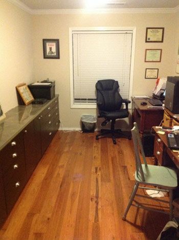
Who: Mark P.
Where: Portland, OR
Mark made like the reaper (trashing the wicker and plaid in the same swoop of the scythe), then transformed the room with light-colored paint that works with the wood floors and the dark furniture.
Who did the work: “I did all the work myself.”
See all the images from this entry.
From Floral Overkill to Fresh Understatement: Before
Who: Aaron B.
Where: Bradenton, FL
We’ve got two words for these tulips: great grandma. The fussy pink-and-blue pattern practically reeks of old-fashioned toilet water and fails to evoke the relaxing vibe you want in the bath.
From Floral Overkill to Fresh Understatement: After
Who: Aaron B.
Where: Bradenton, FL
Aaron was going for a “clean, modern look.” His renovation features pale green paint and a glass wall for a serene, spa-like effect.
Who did the work: “I did most of the work myself.”
See all the images from this entry.
From Gaudy Distraction to Stately Simplicity: Before
Who: Cindy B.
Where: Cape Girardeau, MO
This may well have been the fustiest floral ever to come on a roll. It detracts from the noble, dark wood of the foyer.
From Gaudy Distraction to Stately Simplicity: After

Who: Cindy B.
Where: Cape Girardeau, MO
Once the paper was purged, Cindy went for fawn-colored paint plus white molding and stair risers to give the space lightened up yet still stately appeal.
Who did the work: “I did some of the work myself but a contractor did most of it.”
See all the images from this entry.
From Seventies Flashback to Modern Marvel: Before
Who: Stephanie S.
Where: Staten Island, NY
Cue the prog rock! Nothing screams Seventies like harvest gold and avocado.
From Seventies Flashback to Modern Marvel: After

Who: Stephanie S.
Where: Staten Island, NY
Stephanie stripped the paper—which she remembers as the redo’s toughest challenge—going with mosaic tiles and buff paint for a clean, modern yet warmly welcoming space.
Who did the work: “I did some of the work myself but a contractor did most of it.”
See all the images from this entry.
From Dark and Dingy to Spa-Like Serenity: Before
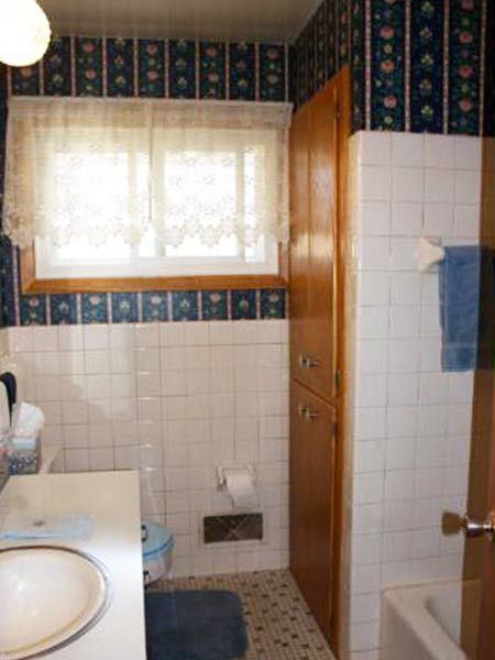
Who: Kalena C.
Where: White Bear Lake, MN
This dark, drab pattern made Kalena’s bathroom look and feel like a lock box. The clinical white tile didn’t help.
From Dark and Dingy to Spa-Like Serenity: After
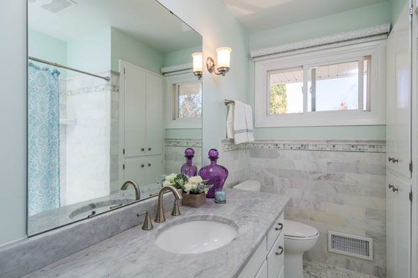
Who: Kalena C.
Where: White Bear Lake, MN
Kalena swapped the paper for seafoam-green paint, a dewy hue that complements the white cabinetry and marble. She relied on design input from Sherwin-Williams, the cost of which was reimbursed from the purchase of the paint.
Who did the work: “I did some of the work myself but a contractor did most of it.”