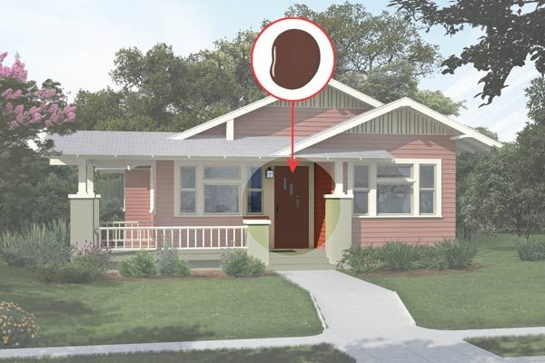
Before
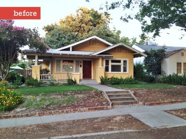
“Architecturally, I like the house,” Dan Hayden says of the 1915 bungalow he shares with his wife, Terri, in Kingsburg, California. Its color, however, is another story. Both agree it’s too harsh. “It’s not quite caution-sign yellow, but almost,” Dan says.
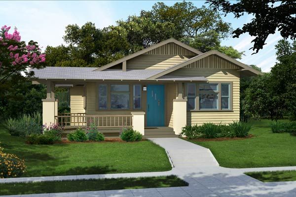
After
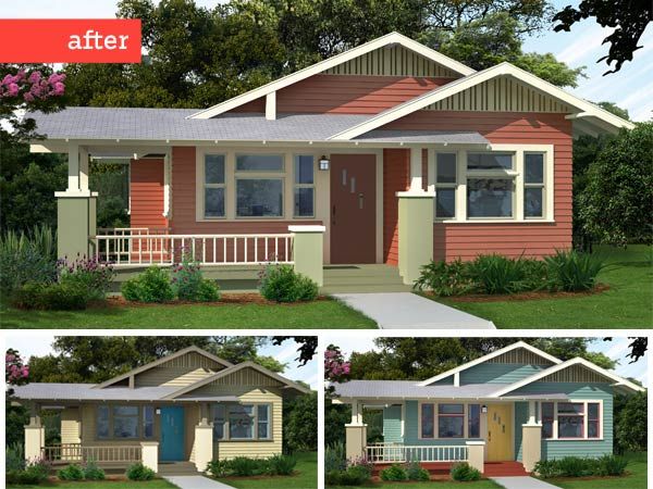
To help the couple select a more inviting palette, we enlisted the help of Amy Wax, a color consultant in Montclair, New Jersey. “Yellow wasn’t necessarily a poor choice,” says Wax. “The real problem here is that all of the architectural elements are painted the same color, causing them to blur together.” In the three color combinations she created to inspire the Haydens, the trim, stucco columns and vertical siding, horizontal clapboards, and porch flooring all get their own hue. The earthy palettes here and on the next page stay true to Craftsman style but vary in boldness. A rust-colored facade with moss-green accents is the richest of the group, while an understated combo of tans and blues plus a dusky blue base punched up with reds and gold present brighter options.
“The red is probably our favorite,” Dan says. “We love its warmth, and it’s a little daring.”
Pick Your Palette
Here are three nature-inspired color schemes, all perfectly suited to an authentic, early-20th-century bungalow.
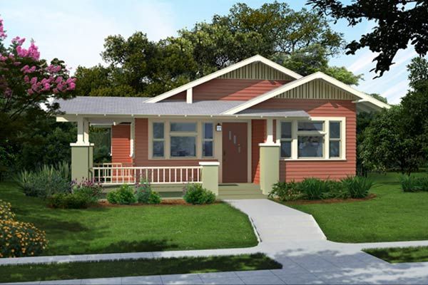
Muted Red
“These colors are as inviting as they come,” Wax says. Painting a facade red is a sure way to make a statement, but the softness of this shade matched with several soothing greens keeps the palette from appearing loud. The reddish-brown front door just adds to this scheme’s earthy feel, while cream trim ensures that the dark hues pop.
Muted Red: Audubon Russet
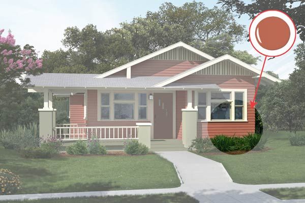
Benjamin Moore’s Audubon Russet
Muted Red: Georgian Green
Benjamin Moore’s Georgian Green
Muted Red: Monterey White
Benjamin Moore’s Monterey White
Muted Red: Tate Olive
Benjamin Moore’s Tate Olive
Muted Red: Guilford Green
Benjamin Moore’s Guilford Green
Muted Red: Hasbrouck Brown
Benjamin Moore’s Hasbrouck Brown
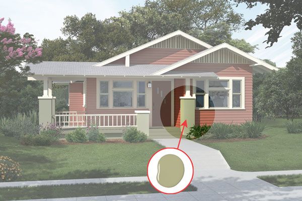
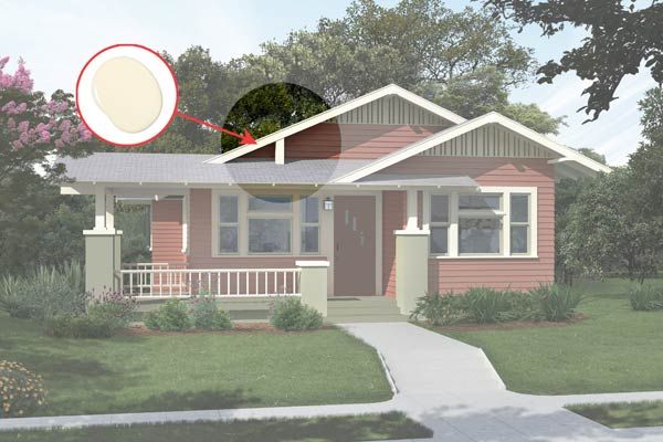
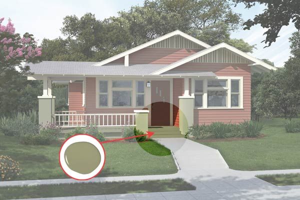
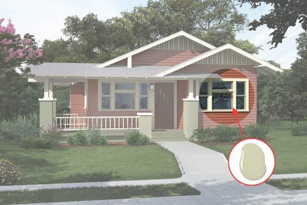
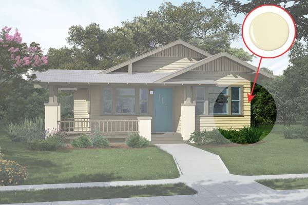
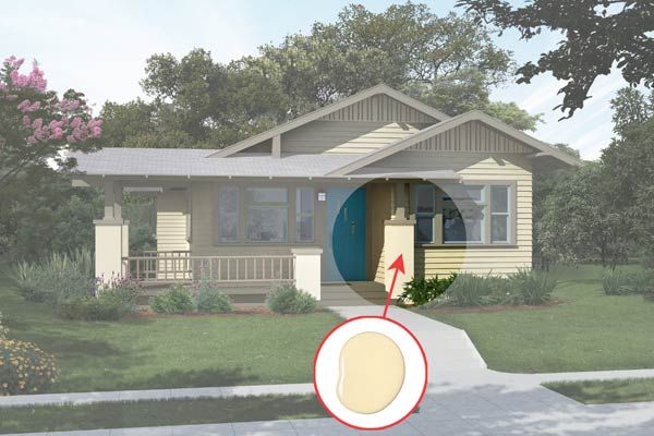
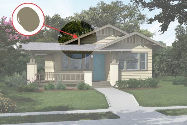
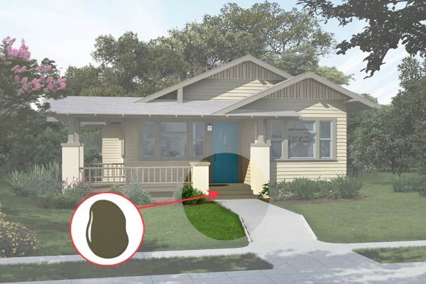
Rich Tan
“Saturated colors were the norm for houses built in 1915,” Wax says. This khaki facade shade is on the bright side, but dark trim in spirited hues of blue and green maintains a vintage vibe. The olive porch floor balances out this lighter palette while also visually anchoring the house.
Rich Tan: White Cliffs
Behr’s White Cliffs
Rich Tan: Mojito
Behr’s Mojito
Rich Tan: Mossy Bank
Behr’s Mossy Bank
Rich Tan: Alligator Skin
Behr’s Alligator Skin
Rich Tan: Lap Pool Blue
Behr’s Lap Pool Blue
Rich Tan: Bermudan Blue
Behr’s Bermudan Blue
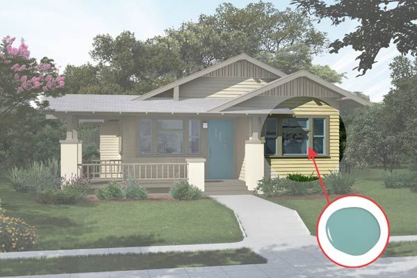
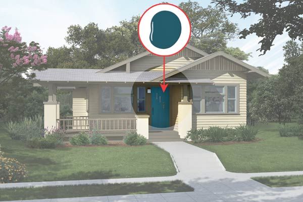
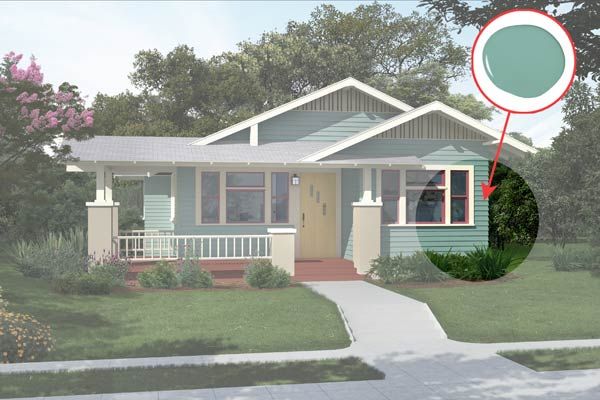
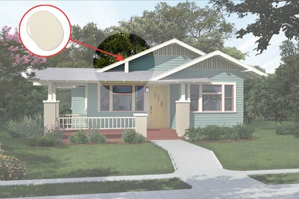
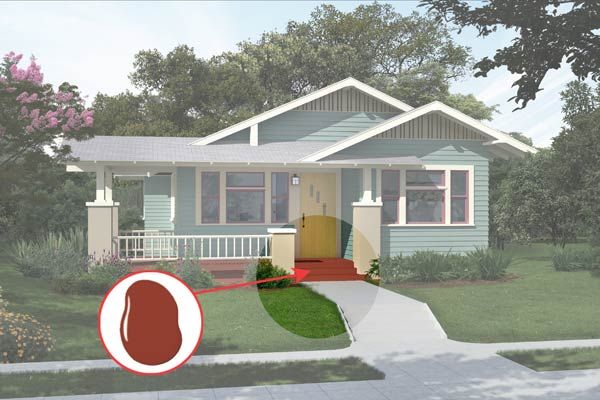
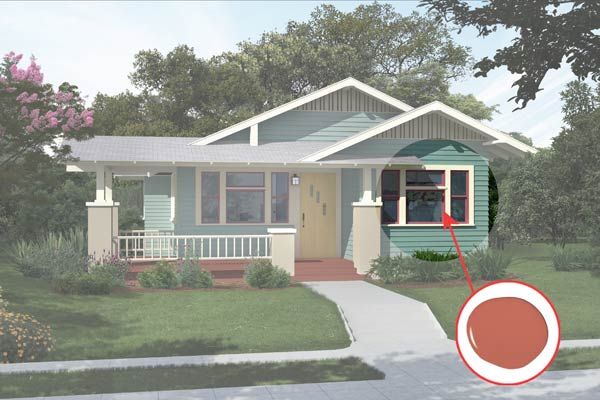
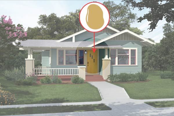
Cool Blue
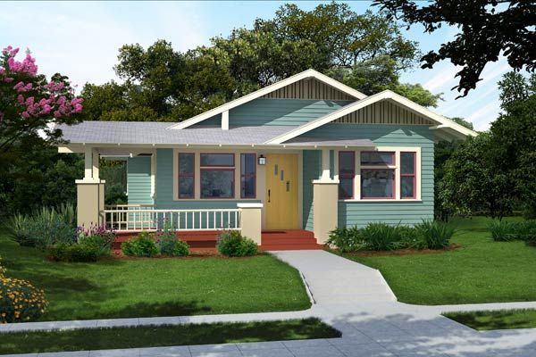
The pale gray roof was the driving force behind this combination. Asphalt shingles break from a traditional Craftsman look, but the swath of blue siding with an otherwise warm palette helps tie them in. “And I love the gold front door,” Wax says. “It’s bright, happy, and really welcoming.”
Cool Blue: Composed
Sherwin-Williams’s Composed
Cool Blue: Favorite Tan
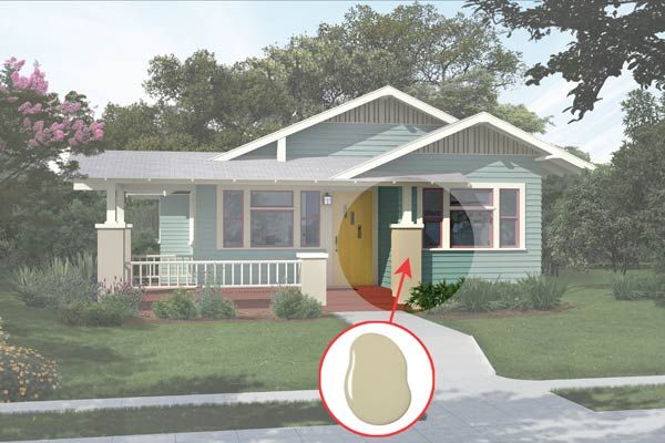
Sherwin-Williams’s Favorite Tan
Cool Blue: Nacre
Sherwin-Williams’s Nacre
Cool Blue: Fired Brick
Sherwin-Williams’s Fired Brick
Cool Blue: Foxy
Sherwin-Williams’s Foxy
Cool Blue: Mannered Gold
Sherwin-Williams’s Mannered Gold